继承者: QCommonStyle , QProxyStyle
def
combinedLayoutSpacing
(controls1, controls2, orientation[, option=None[, widget=None]])
def
proxy
()
def
drawComplexControl
(cc, opt, p[, widget=None])
def
drawControl
(element, opt, p[, widget=None])
def
drawItemPixmap
(painter, rect, alignment, pixmap)
def
drawItemText
(painter, rect, flags, pal, enabled, text[, textRole=QPalette.NoRole])
def
drawPrimitive
(pe, opt, p[, widget=None])
def
generatedIconPixmap
(iconMode, pixmap, opt)
def
hitTestComplexControl
(cc, opt, pt[, widget=None])
def
itemPixmapRect
(r, flags, pixmap)
def
itemTextRect
(fm, r, flags, enabled, text)
def
layoutSpacing
(control1, control2, orientation[, option=None[, widget=None]])
def
pixelMetric
(metric[, option=None[, widget=None]])
def
polish
(application)
def
polish
(palette)
def
polish
(widget)
def
sizeFromContents
(ct, opt, contentsSize[, w=None])
def
standardIcon
(standardIcon[, option=None[, widget=None]])
def
standardPalette
()
def
standardPixmap
(standardPixmap[, opt=None[, widget=None]])
def
styleHint
(stylehint[, opt=None[, widget=None[, returnData=None]]])
def
subControlRect
(cc, opt, sc[, widget=None])
def
subElementRect
(subElement, option[, widget=None])
def
unpolish
(application)
def
unpolish
(widget)
def
alignedRect
(direction, alignment, size, rectangle)
def
sliderPositionFromValue
(min, max, val, space[, upsideDown=false])
def
sliderValueFromPosition
(min, max, pos, space[, upsideDown=false])
def
visualAlignment
(direction, alignment)
def
visualPos
(direction, boundingRect, logicalPos)
def
visualRect
(direction, boundingRect, logicalRect)
Qt contains a set of
QStylesubclasses that emulate the styles of the different platforms supported by Qt (QWindowsStyle, QMacStyle etc.). By default, these styles are built into the Qt GUI module. Styles can also be made available as plugins.Qt’s built-in widgets use
QStyleto perform nearly all of their drawing, ensuring that they look exactly like the equivalent native widgets. The diagram below shows aQComboBox按 9 种不同风格。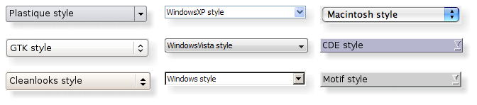
话题:
可以设置整个应用程序的样式使用
setStyle()function. It can also be specified by the user of the application, using the-style命令行选项:python myapplication.py -style windowsIf no style is specified, Qt will choose the most appropriate style for the user’s platform or desktop environment.
还可以为个别小部件设置样式使用
setStyle()函数。
If you are developing custom widgets and want them to look good on all platforms, you can use
QStylefunctions to perform parts of the widget drawing, such asdrawItemText(),drawItemPixmap(),drawPrimitive(),drawControl(),和drawComplexControl().Most
QStyledraw functions take four arguments:
an enum value specifying which graphical element to draw
a
QStyleOptionspecifying how and where to render that elementa
QPainter用于绘制元素a
QWidgeton which the drawing is performed (optional)例如,若希望在 Widget 中绘制聚焦矩形,可以编写:
def paintEvent(self, event):
    painter = QPainter(self)
    option = QStyleOptionFocusRect()
    option.initFrom(self)
    option.backgroundColor = palette().color(QPalette.Background)
    style().drawPrimitive(QStyle.PE_FrameFocusRect, option, painter, self)
QStylegets all the information it needs to render the graphical element fromQStyleOption. The widget is passed as the last argument in case the style needs it to perform special effects (such as animated default buttons on macOS), but it isn’t mandatory. In fact, you can useQStyleto draw on any paint device, not just widgets, by setting theQPainter正确。
QStyleOptionhas various subclasses for the various types of graphical elements that can be drawn. For example,PE_FrameFocusRectexpects aQStyleOptionFocusRect自变量。To ensure that drawing operations are as fast as possible,
QStyleOptionand its subclasses have public data members. See theQStyleOptionclass documentation for details on how to use it.为方便起见,Qt 提供
QStylePainterclass, which combines aQStyle,QPainter,和QWidget。这使之可能编写painter = QStylePainter(self) ... painter.drawPrimitive(QStyle.PE_FrameFocusRect, option)而不是
painter = QPainter(self)
...
style().drawPrimitive(QStyle.PE_FrameFocusRect, option, painter, self)
You can create a custom look and feel for your application by creating a custom style. There are two approaches to creating a custom style. In the static approach, you either choose an existing
QStyleclass, subclass it, and reimplement virtual functions to provide the custom behavior, or you create an entireQStyleclass from scratch. In the dynamic approach, you modify the behavior of your system style at runtime. The static approach is described below. The dynamic approach is described inQProxyStyle.The first step in the static approach is to pick one of the styles provided by Qt from which you will build your custom style. Your choice of
QStyleclass will depend on which style resembles your desired style the most. The most general class that you can use as a base isQCommonStyle(notQStyle). This is because Qt requires its styles to beQCommonStyles.Depending on which parts of the base style you want to change, you must reimplement the functions that are used to draw those parts of the interface. To illustrate this, we will modify the look of the spin box arrows drawn by QWindowsStyle. The arrows are primitive elements that are drawn by the
drawPrimitive()function, so we need to reimplement that function. We need the following class declaration:class CustomStyle(QProxyStyle): ... def drawPrimitive(PrimitiveElement element, const QStyleOption *option, QPainter *painter, const QWidget *widget) const; # element : PrimitiveElement # option : QStyleOption # painter : QPainter # widget : QWidget ...要绘制它的向上 向下箭头,
QSpinBox使用PE_IndicatorSpinUpandPE_IndicatorSpinDownprimitive elements. Here’s how to reimplement thedrawPrimitive()function to draw them differently:void CustomStyle::drawPrimitive(PrimitiveElement element, const QStyleOption *option, QPainter *painter, const QWidget *widget) const { if (element == PE_IndicatorSpinUp || element == PE_IndicatorSpinDown) { QPolygon points(3); int x = option->rect.x(); int y = option->rect.y(); int w = option->rect.width() / 2; int h = option->rect.height() / 2; x += (option->rect.width() - w) / 2; y += (option->rect.height() - h) / 2; if (element == PE_IndicatorSpinUp) { points[0] = QPoint(x, y + h); points[1] = QPoint(x + w, y + h); points[2] = QPoint(x + w / 2, y); } else { // PE_SpinBoxDown points[0] = QPoint(x, y); points[1] = QPoint(x + w, y); points[2] = QPoint(x + w / 2, y + h); } if (option->state & State_Enabled) { painter->setPen(option->palette.mid().color()); painter->setBrush(option->palette.buttonText()); } else { painter->setPen(option->palette.buttonText().color()); painter->setBrush(option->palette.mid()); } painter->drawPolygon(points); } else { QProxyStyle::drawPrimitive(element, option, painter, widget); } }Notice that we don’t use the
widgetargument, except to pass it on to the QWindowStyle::drawPrimitive() function. As mentioned earlier, the information about what is to be drawn and how it should be drawn is specified by aQStyleOptionobject, so there is no need to ask the widget.若需要使用
widgetargument to obtain additional information, be careful to ensure that it isn’t 0 and that it is of the correct type before using it. For example:const QSpinBox *spinBox = qobject_cast<const QSpinBox *>(widget); if (spinBox) { ... }When implementing a custom style, you cannot assume that the widget is a
QSpinBoxjust because the enum value is calledPE_IndicatorSpinUporPE_IndicatorSpinDown.The documentation for the 样式 example covers this topic in more detail.
警告
Qt style sheets are currently not supported for custom
QStylesubclasses. We plan to address this in some future release.
There are several ways of using a custom style in a Qt application. The simplest way is to pass the custom style to the
setStyle()static function before creating theQApplication对象:#include <QtWidgets> #include "customstyle.h" int main(int argc, char *argv[]) { QApplication::setStyle(new CustomStyle); QApplication app(argc, argv); QSpinBox spinBox; spinBox.show(); return app.exec(); }可以调用
setStyle()at any time, but by calling it before the constructor, you ensure that the user’s preference, set using the-stylecommand-line option, is respected.You may want to make your custom style available for use in other applications, which may not be yours and hence not available for you to recompile. The Qt Plugin system makes it possible to create styles as plugins. Styles created as plugins are loaded as shared objects at runtime by Qt itself. Please refer to the Qt Plugin documentation for more information on how to go about creating a style plugin.
Compile your plugin and put it into Qt’s
plugins/stylesdirectory. We now have a pluggable style that Qt can load automatically. To use your new style with existing applications, simply start the application with the following argument:python myapplication.py -style customThe application will use the look and feel from the custom style you implemented.
Languages written from right to left (such as Arabic and Hebrew) usually also mirror the whole layout of widgets, and require the light to come from the screen’s top-right corner instead of top-left.
If you create a custom style, you should take special care when drawing asymmetric elements to make sure that they also look correct in a mirrored layout. An easy way to test your styles is to run applications with the
-reversecommand-line option or to callsetLayoutDirection()在您的main()函数。Here are some things to keep in mind when making a style work well in a right-to-left environment:
subControlRect()andsubElementRect()return rectangles in screen coordinatesQStyleOption::direction indicates in which direction the item should be drawn in
If a style is not right-to-left aware it will display items as if it were left-to-right
visualRect(),visualPos(),和visualAlignment()are helpful functions that will translate from logical to screen representations.
alignedRect()will return a logical rect aligned for the current direction
The painting of items in views is performed by a delegate. Qt’s default delegate,
QStyledItemDelegate, is also used for calculating bounding rectangles of items, and their sub-elements for the various kind of itemdata rolesQStyledItemDelegatesupports. See theQStyledItemDelegateclass description to find out which datatypes and roles are supported. You can read more about item data roles in 模型/视图编程 .当
QStyledItemDelegatepaints its items, it drawsCE_ItemViewItem, and calculates their size withCT_ItemViewItem. Note also that it usesSE_ItemViewItemTextto set the size of editors. When implementing a style to customize drawing of item views, you need to check the implementation ofQCommonStyle(and any other subclasses from which your style inherits). This way, you find out which and how other style elements are painted, and you can then reimplement the painting of elements that should be drawn differently.We include a small example where we customize the drawing of item backgrounds.
switch (element) {
    case (PE_PanelItemViewItem): {
        painter->save();
        QPoint topLeft = option->rect.topLeft();
        QPoint bottomRight = option->rect.topRight();
        QLinearGradient backgroundGradient(topLeft, bottomRight);
        backgroundGradient.setColorAt(0.0, QColor(Qt::yellow).lighter(190));
        backgroundGradient.setColorAt(1.0, Qt::white);
        painter->fillRect(option->rect, QBrush(backgroundGradient));
        painter->restore();
    break;
    }
    default:
        QProxyStyle::drawPrimitive(element, option, painter, widget);
}
The primitive element
PE_PanelItemViewItemis responsible for painting the background of items, and is called fromQCommonStyle‘s implementation ofCE_ItemViewItem.To add support for drawing of new datatypes and item data roles, it is necessary to create a custom delegate. But if you only need to support the datatypes implemented by the default delegate, a custom style does not need an accompanying delegate. The
QStyledItemDelegateclass description gives more information on custom delegates.The drawing of item view headers is also done by the style, giving control over size of header items and row and column sizes.
QStyle
构造样式对象。
PySide2.QtWidgets.QStyle.
StateFlag
This enum describes flags that are used when drawing primitive elements.
Note that not all primitives use all of these flags, and that the flags may mean different things to different items.
|
常量 |
描述 |
|---|---|
|
QStyle.State_None |
Indicates that the widget does not have a state. |
|
QStyle.State_Active |
Indicates that the widget is active. |
|
QStyle.State_AutoRaise |
Used to indicate if auto-raise appearance should be used on a tool button. |
|
QStyle.State_Children |
Used to indicate if an item view branch has children. |
|
QStyle.State_DownArrow |
Used to indicate if a down arrow should be visible on the widget. |
|
QStyle.State_Editing |
Used to indicate if an editor is opened on the widget. |
|
QStyle.State_Enabled |
Used to indicate if the widget is enabled. |
|
QStyle.State_HasEditFocus |
Used to indicate if the widget currently has edit focus. |
|
QStyle.State_HasFocus |
Used to indicate if the widget has focus. |
|
QStyle.State_Horizontal |
Used to indicate if the widget is laid out horizontally, for example. a tool bar. |
|
QStyle.State_KeyboardFocusChange |
Used to indicate if the focus was changed with the keyboard, e.g., tab, backtab or shortcut. |
|
QStyle.State_MouseOver |
Used to indicate if the widget is under the mouse. |
|
QStyle.State_NoChange |
Used to indicate a tri-state checkbox. |
|
QStyle.State_Off |
Used to indicate if the widget is not checked. |
|
QStyle.State_On |
Used to indicate if the widget is checked. |
|
QStyle.State_Raised |
Used to indicate if a button is raised. |
|
QStyle.State_ReadOnly |
Used to indicate if a widget is read-only. |
|
QStyle.State_Selected |
Used to indicate if a widget is selected. |
|
QStyle.State_Item |
Used by item views to indicate if a horizontal branch should be drawn. |
|
QStyle.State_Open |
Used by item views to indicate if the tree branch is open. |
|
QStyle.State_Sibling |
Used by item views to indicate if a vertical line needs to be drawn (for siblings). |
|
QStyle.State_Sunken |
Used to indicate if the widget is sunken or pressed. |
|
QStyle.State_UpArrow |
Used to indicate if an up arrow should be visible on the widget. |
|
QStyle.State_Mini |
Used to indicate a mini style Mac widget or button. |
|
QStyle.State_Small |
Used to indicate a small style Mac widget or button. |
另请参阅
PySide2.QtWidgets.QStyle.
PrimitiveElement
This enum describes the various primitive elements. A primitive element is a common GUI element, such as a checkbox indicator or button bevel.
|
常量 |
描述 |
|---|---|
|
QStyle.PE_FrameStatusBar |
Obsolete. Use instead. |
|
QStyle.PE_PanelButtonCommand |
Button used to initiate an action, for example, a
|
|
QStyle.PE_FrameDefaultButton |
This frame around a default button, e.g. in a dialog. |
|
QStyle.PE_PanelButtonBevel |
Generic panel with a button bevel. |
|
QStyle.PE_PanelButtonTool |
Panel for a Tool button, used with
|
|
QStyle.PE_PanelLineEdit |
Panel for a
|
|
QStyle.PE_IndicatorButtonDropDown |
Indicator for a drop down button, for example, a tool button that displays a menu. |
|
QStyle.PE_FrameFocusRect |
Generic focus indicator. |
|
QStyle.PE_IndicatorArrowUp |
Generic Up arrow. |
|
QStyle.PE_IndicatorArrowDown |
Generic Down arrow. |
|
QStyle.PE_IndicatorArrowRight |
Generic Right arrow. |
|
QStyle.PE_IndicatorArrowLeft |
Generic Left arrow. |
|
QStyle.PE_IndicatorSpinUp |
Up symbol for a spin widget, for example a
|
|
QStyle.PE_IndicatorSpinDown |
Down symbol for a spin widget. |
|
QStyle.PE_IndicatorSpinPlus |
Increase symbol for a spin widget. |
|
QStyle.PE_IndicatorSpinMinus |
Decrease symbol for a spin widget. |
|
QStyle.PE_IndicatorItemViewItemCheck |
On/off indicator for a view item. |
|
QStyle.PE_IndicatorCheckBox |
On/off indicator, for example, a
|
|
QStyle.PE_IndicatorRadioButton |
Exclusive on/off indicator, for example, a
|
|
QStyle.PE_IndicatorDockWidgetResizeHandle |
Resize handle for dock windows. |
|
QStyle.PE_Frame |
Generic frame |
|
QStyle.PE_FrameMenu |
Frame for popup windows/menus; see also
|
|
QStyle.PE_PanelMenuBar |
Panel for menu bars. |
|
QStyle.PE_PanelScrollAreaCorner |
Panel at the bottom-right (or bottom-left) corner of a scroll area. |
|
QStyle.PE_FrameDockWidget |
Panel frame for dock windows and toolbars. |
|
QStyle.PE_FrameTabWidget |
Frame for tab widgets. |
|
QStyle.PE_FrameLineEdit |
Panel frame for line edits. |
|
QStyle.PE_FrameGroupBox |
Panel frame around group boxes. |
|
QStyle.PE_FrameButtonBevel |
Panel frame for a button bevel. |
|
QStyle.PE_FrameButtonTool |
Panel frame for a tool button. |
|
QStyle.PE_IndicatorHeaderArrow |
Arrow used to indicate sorting on a list or table header. |
|
QStyle.PE_FrameStatusBarItem |
Frame for an item of a status bar; see also
|
|
QStyle.PE_FrameWindow |
Frame around a MDI window or a docking window. |
|
QStyle.PE_IndicatorMenuCheckMark |
Check mark used in a menu. |
|
QStyle.PE_IndicatorProgressChunk |
Section of a progress bar indicator; see also
|
|
QStyle.PE_IndicatorBranch |
Lines used to represent the branch of a tree in a tree view. |
|
QStyle.PE_IndicatorToolBarHandle |
The handle of a toolbar. |
|
QStyle.PE_IndicatorToolBarSeparator |
The separator in a toolbar. |
|
QStyle.PE_PanelToolBar |
The panel for a toolbar. |
|
QStyle.PE_PanelTipLabel |
The panel for a tip label. |
|
QStyle.PE_FrameTabBarBase |
The frame that is drawn for a tab bar, ususally drawn for a tab bar that isn’t part of a tab widget. |
|
QStyle.PE_IndicatorTabTear |
Deprecated. Use PE_IndicatorTabTearLeft instead. |
|
QStyle.PE_IndicatorTabTearLeft |
An indicator that a tab is partially scrolled out on the left side of the visible tab bar when there are many tabs. |
|
QStyle.PE_IndicatorTabTearRight |
An indicator that a tab is partially scrolled out on the right side of the visible tab bar when there are many tabs. |
|
QStyle.PE_IndicatorColumnViewArrow |
An arrow in a
|
|
QStyle.PE_Widget |
A plain
|
|
QStyle.PE_CustomBase |
Base value for custom primitive elements. All values above this are reserved for custom use. Custom values must be greater than this value. |
|
QStyle.PE_IndicatorItemViewItemDrop |
An indicator that is drawn to show where an item in an item view is about to be dropped during a drag-and-drop operation in an item view. |
|
QStyle.PE_PanelItemViewItem |
The background for an item in an item view. |
|
QStyle.PE_PanelItemViewRow |
The background of a row in an item view. |
|
QStyle.PE_PanelStatusBar |
The panel for a status bar. |
|
QStyle.PE_IndicatorTabClose |
The close button on a tab bar. |
|
QStyle.PE_PanelMenu |
The panel for a menu. |
另请参阅
PySide2.QtWidgets.QStyle.
ControlElement
This enum represents a control element. A control element is a part of a widget that performs some action or displays information to the user.
|
常量 |
描述 |
|---|---|
|
QStyle.CE_PushButton |
A
|
|
QStyle.CE_PushButtonBevel |
The bevel and default indicator of a
|
|
QStyle.CE_PushButtonLabel |
The label (an icon with text or pixmap) of a
|
|
QStyle.CE_DockWidgetTitle |
停放窗口标题。 |
|
QStyle.CE_Splitter |
分割器手柄;另请参阅
|
|
QStyle.CE_CheckBox |
A
|
|
QStyle.CE_CheckBoxLabel |
The label (text or pixmap) of a
|
|
QStyle.CE_RadioButton |
A
|
|
QStyle.CE_RadioButtonLabel |
The label (text or pixmap) of a
|
|
QStyle.CE_TabBarTab |
The tab and label within a
|
|
QStyle.CE_TabBarTabShape |
The tab shape within a tab bar. |
|
QStyle.CE_TabBarTabLabel |
选项卡内标签。 |
|
QStyle.CE_ProgressBar |
A
|
|
QStyle.CE_ProgressBarGroove |
The groove where the progress indicator is drawn in a
|
|
QStyle.CE_ProgressBarContents |
The progress indicator of a
|
|
QStyle.CE_ProgressBarLabel |
The text label of a
|
|
QStyle.CE_ToolButtonLabel |
A tool button’s label. |
|
QStyle.CE_MenuBarItem |
菜单项在
|
|
QStyle.CE_MenuBarEmptyArea |
The empty area of a
|
|
QStyle.CE_MenuItem |
菜单项在
|
|
QStyle.CE_MenuScroller |
Scrolling areas in a
|
|
QStyle.CE_MenuTearoff |
A menu item representing the tear off section of a
|
|
QStyle.CE_MenuEmptyArea |
The area in a menu without menu items. |
|
QStyle.CE_MenuHMargin |
The horizontal extra space on the left/right of a menu. |
|
QStyle.CE_MenuVMargin |
The vertical extra space on the top/bottom of a menu. |
|
QStyle.CE_ToolBoxTab |
The toolbox’s tab and label within a
|
|
QStyle.CE_SizeGrip |
Window resize handle; see also
|
|
QStyle.CE_Header |
A header. |
|
QStyle.CE_HeaderSection |
头部区间。 |
|
QStyle.CE_HeaderLabel |
The header’s label. |
|
QStyle.CE_ScrollBarAddLine |
Scroll bar line increase indicator. (i.e., scroll down); see also
|
|
QStyle.CE_ScrollBarSubLine |
Scroll bar line decrease indicator (i.e., scroll up). |
|
QStyle.CE_ScrollBarAddPage |
Scolllbar page increase indicator (i.e., page down). |
|
QStyle.CE_ScrollBarSubPage |
Scroll bar page decrease indicator (i.e., page up). |
|
QStyle.CE_ScrollBarSlider |
滚动条滑块。 |
|
QStyle.CE_ScrollBarFirst |
Scroll bar first line indicator (i.e., home). |
|
QStyle.CE_ScrollBarLast |
Scroll bar last line indicator (i.e., end). |
|
QStyle.CE_RubberBand |
Rubber band used in for example an icon view. |
|
QStyle.CE_FocusFrame |
Focus frame that is style controlled. |
|
QStyle.CE_ItemViewItem |
在项视图内的项。 |
|
QStyle.CE_CustomBase |
Base value for custom control elements; custom values must be greater than this value. |
|
QStyle.CE_ComboBoxLabel |
The label of a non-editable
|
|
QStyle.CE_ToolBar |
工具栏像
|
|
QStyle.CE_ToolBoxTabShape |
The toolbox’s tab shape. |
|
QStyle.CE_ToolBoxTabLabel |
The toolbox’s tab label. |
|
QStyle.CE_HeaderEmptyArea |
The area of a header view where there are no header sections. |
|
QStyle.CE_ShapedFrame |
The frame with the shape specified in the
|
另请参阅
PySide2.QtWidgets.QStyle.
SubElement
This enum represents a sub-area of a widget. Style implementations use these areas to draw the different parts of a widget.
|
常量 |
描述 |
|---|---|
|
QStyle.SE_PushButtonContents |
Area containing the label (icon with text or pixmap). |
|
QStyle.SE_PushButtonFocusRect |
Area for the focus rect (usually larger than the contents rect). |
|
QStyle.SE_PushButtonLayoutItem |
Area that counts for the parent layout. |
|
QStyle.SE_PushButtonBevel |
[since 5.15] Area used for the bevel of the button. |
|
QStyle.SE_CheckBoxIndicator |
Area for the state indicator (e.g., check mark). |
|
QStyle.SE_CheckBoxContents |
Area for the label (text or pixmap). |
|
QStyle.SE_CheckBoxFocusRect |
Area for the focus indicator. |
|
QStyle.SE_CheckBoxClickRect |
Clickable area, defaults to . |
|
QStyle.SE_CheckBoxLayoutItem |
Area that counts for the parent layout. |
|
QStyle.SE_DateTimeEditLayoutItem |
Area that counts for the parent layout. |
|
QStyle.SE_RadioButtonIndicator |
Area for the state indicator. |
|
QStyle.SE_RadioButtonContents |
Area for the label. |
|
QStyle.SE_RadioButtonFocusRect |
Area for the focus indicator. |
|
QStyle.SE_RadioButtonClickRect |
Clickable area, defaults to . |
|
QStyle.SE_RadioButtonLayoutItem |
Area that counts for the parent layout. |
|
QStyle.SE_ComboBoxFocusRect |
Area for the focus indicator. |
|
QStyle.SE_SliderFocusRect |
Area for the focus indicator. |
|
QStyle.SE_SliderLayoutItem |
Area that counts for the parent layout. |
|
QStyle.SE_SpinBoxLayoutItem |
Area that counts for the parent layout. |
|
QStyle.SE_ProgressBarGroove |
Area for the groove. |
|
QStyle.SE_ProgressBarContents |
Area for the progress indicator. |
|
QStyle.SE_ProgressBarLabel |
Area for the text label. |
|
QStyle.SE_ProgressBarLayoutItem |
Area that counts for the parent layout. |
|
QStyle.SE_FrameContents |
Area for a frame’s contents. |
|
QStyle.SE_ShapedFrameContents |
Area for a frame’s contents using the shape in
|
|
QStyle.SE_FrameLayoutItem |
Area that counts for the parent layout. |
|
QStyle.SE_HeaderArrow |
Area for the sort indicator for a header. |
|
QStyle.SE_HeaderLabel |
Area for the label in a header. |
|
QStyle.SE_LabelLayoutItem |
Area that counts for the parent layout. |
|
QStyle.SE_LineEditContents |
Area for a line edit’s contents. |
|
QStyle.SE_TabWidgetLeftCorner |
Area for the left corner widget in a tab widget. |
|
QStyle.SE_TabWidgetRightCorner |
Area for the right corner widget in a tab widget. |
|
QStyle.SE_TabWidgetTabBar |
Area for the tab bar widget in a tab widget. |
|
QStyle.SE_TabWidgetTabContents |
Area for the contents of the tab widget. |
|
QStyle.SE_TabWidgetTabPane |
Area for the pane of a tab widget. |
|
QStyle.SE_TabWidgetLayoutItem |
Area that counts for the parent layout. |
|
QStyle.SE_ToolBoxTabContents |
Area for a toolbox tab’s icon and label. |
|
QStyle.SE_ToolButtonLayoutItem |
Area that counts for the parent layout. |
|
QStyle.SE_ItemViewItemCheckIndicator |
Area for a view item’s check mark. |
|
QStyle.SE_TabBarTearIndicator |
Deprecated. Use instead. |
|
QStyle.SE_TabBarTearIndicatorLeft |
Area for the tear indicator on the left side of a tab bar with scroll arrows. |
|
QStyle.SE_TabBarTearIndicatorRight |
Area for the tear indicator on the right side of a tab bar with scroll arrows. |
|
QStyle.SE_TabBarScrollLeftButton |
Area for the scroll left button on a tab bar with scroll buttons. |
|
QStyle.SE_TabBarScrollRightButton |
Area for the scroll right button on a tab bar with scroll buttons. |
|
QStyle.SE_TreeViewDisclosureItem |
Area for the actual disclosure item in a tree branch. |
|
QStyle.SE_GroupBoxLayoutItem |
Area that counts for the parent layout. |
|
QStyle.SE_CustomBase |
Base value for custom sub-elements. Custom values must be greater than this value. |
|
QStyle.SE_DockWidgetFloatButton |
The float button of a dock widget. |
|
QStyle.SE_DockWidgetTitleBarText |
The text bounds of the dock widgets title. |
|
QStyle.SE_DockWidgetCloseButton |
The close button of a dock widget. |
|
QStyle.SE_DockWidgetIcon |
The icon of a dock widget. |
|
QStyle.SE_ComboBoxLayoutItem |
Area that counts for the parent layout. |
|
QStyle.SE_ItemViewItemDecoration |
Area for a view item’s decoration (icon). |
|
QStyle.SE_ItemViewItemText |
Area for a view item’s text. |
|
QStyle.SE_ItemViewItemFocusRect |
Area for a view item’s focus rect. |
|
QStyle.SE_TabBarTabLeftButton |
Area for a widget on the left side of a tab in a tab bar. |
|
QStyle.SE_TabBarTabRightButton |
Area for a widget on the right side of a tab in a tab bar. |
|
QStyle.SE_TabBarTabText |
Area for the text on a tab in a tab bar. |
|
QStyle.SE_ToolBarHandle |
Area for the handle of a tool bar. |
另请参阅
PySide2.QtWidgets.QStyle.
ComplexControl
This enum describes the available complex controls. Complex controls have different behavior depending upon where the user clicks on them or which keys are pressed.
|
常量 |
描述 |
|---|---|
|
QStyle.CC_SpinBox |
自旋框,像
|
|
QStyle.CC_ComboBox |
组合框,像
|
|
QStyle.CC_ScrollBar |
滚动条,像
|
|
QStyle.CC_Slider |
滑块,像
|
|
QStyle.CC_ToolButton |
工具按钮,像
|
|
QStyle.CC_TitleBar |
标题栏,像那些使用在
|
|
QStyle.CC_GroupBox |
组框,像
|
|
QStyle.CC_Dial |
表盘,像
|
|
QStyle.CC_MdiControls |
The minimize, close, and normal button in the menu bar for a maximized MDI subwindow. |
|
QStyle.CC_CustomBase |
Base value for custom complex controls. Custom values must be greater than this value. |
另请参阅
SubControl
drawComplexControl()
PySide2.QtWidgets.QStyle.
SubControl
此枚举描述可用子控件。子控件是复杂控件中的控件元素 (
ComplexControl
).
|
常量 |
描述 |
|---|---|
|
QStyle.SC_None |
Special value that matches no other sub control. |
|
QStyle.SC_ScrollBarAddLine |
Scroll bar add line (i.e., down/right arrow); see also
|
|
QStyle.SC_ScrollBarSubLine |
Scroll bar sub line (i.e., up/left arrow). |
|
QStyle.SC_ScrollBarAddPage |
Scroll bar add page (i.e., page down). |
|
QStyle.SC_ScrollBarSubPage |
Scroll bar sub page (i.e., page up). |
|
QStyle.SC_ScrollBarFirst |
Scroll bar first line (i.e., home). |
|
QStyle.SC_ScrollBarLast |
Scroll bar last line (i.e., end). |
|
QStyle.SC_ScrollBarSlider |
Scroll bar slider handle. |
|
QStyle.SC_ScrollBarGroove |
Special sub-control which contains the area in which the slider handle may move. |
|
QStyle.SC_SpinBoxUp |
Spin widget up/increase; see also
|
|
QStyle.SC_SpinBoxDown |
Spin widget down/decrease. |
|
QStyle.SC_SpinBoxFrame |
Spin widget frame. |
|
QStyle.SC_SpinBoxEditField |
Spin widget edit field. |
|
QStyle.SC_ComboBoxEditField |
Combobox edit field; see also
|
|
QStyle.SC_ComboBoxArrow |
Combobox arrow button. |
|
QStyle.SC_ComboBoxFrame |
Combobox frame. |
|
QStyle.SC_ComboBoxListBoxPopup |
The reference rectangle for the combobox popup. Used to calculate the position of the popup. |
|
QStyle.SC_SliderGroove |
Special sub-control which contains the area in which the slider handle may move. |
|
QStyle.SC_SliderHandle |
滑块处理。 |
|
QStyle.SC_SliderTickmarks |
Slider tickmarks. |
|
QStyle.SC_ToolButton |
Tool button (see also
|
|
QStyle.SC_ToolButtonMenu |
Sub-control for opening a popup menu in a tool button. |
|
QStyle.SC_TitleBarSysMenu |
System menu button (i.e., restore, close, etc.). |
|
QStyle.SC_TitleBarMinButton |
最小化按钮。 |
|
QStyle.SC_TitleBarMaxButton |
最大化按钮。 |
|
QStyle.SC_TitleBarCloseButton |
关闭按钮。 |
|
QStyle.SC_TitleBarLabel |
窗口标题标签。 |
|
QStyle.SC_TitleBarNormalButton |
Normal (restore) button. |
|
QStyle.SC_TitleBarShadeButton |
Shade button. |
|
QStyle.SC_TitleBarUnshadeButton |
Unshade button. |
|
QStyle.SC_TitleBarContextHelpButton |
上下文帮助按钮。 |
|
QStyle.SC_DialHandle |
The handle of the dial (i.e. what you use to control the dial). |
|
QStyle.SC_DialGroove |
The groove for the dial. |
|
QStyle.SC_DialTickmarks |
The tickmarks for the dial. |
|
QStyle.SC_GroupBoxFrame |
The frame of a group box. |
|
QStyle.SC_GroupBoxLabel |
The title of a group box. |
|
QStyle.SC_GroupBoxCheckBox |
The optional check box of a group box. |
|
QStyle.SC_GroupBoxContents |
The group box contents. |
|
QStyle.SC_MdiNormalButton |
The normal button for a MDI subwindow in the menu bar. |
|
QStyle.SC_MdiMinButton |
The minimize button for a MDI subwindow in the menu bar. |
|
QStyle.SC_MdiCloseButton |
The close button for a MDI subwindow in the menu bar. |
|
QStyle.SC_All |
Special value that matches all sub-controls. |
另请参阅
ComplexControl
PySide2.QtWidgets.QStyle.
PixelMetric
This enum describes the various available pixel metrics. A pixel metric is a style dependent size represented by a single pixel value.
|
常量 |
描述 |
|---|---|
|
QStyle.PM_ButtonMargin |
Amount of whitespace between push button labels and the frame. |
|
QStyle.PM_DockWidgetTitleBarButtonMargin |
Amount of whitespace between dock widget’s title bar button labels and the frame. |
|
QStyle.PM_ButtonDefaultIndicator |
Width of the default-button indicator frame. |
|
QStyle.PM_MenuButtonIndicator |
Width of the menu button indicator proportional to the widget height. |
|
QStyle.PM_ButtonShiftHorizontal |
Horizontal contents shift of a button when the button is down. |
|
QStyle.PM_ButtonShiftVertical |
Vertical contents shift of a button when the button is down. |
|
QStyle.PM_DefaultFrameWidth |
Default frame width (usually 2). |
|
QStyle.PM_SpinBoxFrameWidth |
Frame width of a spin box, defaults to . |
|
QStyle.PM_ComboBoxFrameWidth |
Frame width of a combo box, defaults to . |
|
QStyle.PM_MDIFrameWidth |
Obsolete. Use instead. |
|
QStyle.PM_MdiSubWindowFrameWidth |
Frame width of an MDI window. |
|
QStyle.PM_MDIMinimizedWidth |
Obsolete. Use instead. |
|
QStyle.PM_MdiSubWindowMinimizedWidth |
Width of a minimized MDI window. |
|
QStyle.PM_LayoutLeftMargin |
默认
|
|
QStyle.PM_LayoutTopMargin |
默认
|
|
QStyle.PM_LayoutRightMargin |
默认
|
|
QStyle.PM_LayoutBottomMargin |
默认
|
|
QStyle.PM_LayoutHorizontalSpacing |
默认
|
|
QStyle.PM_LayoutVerticalSpacing |
默认
|
|
QStyle.PM_MaximumDragDistance |
The maximum allowed distance between the mouse and a scrollbar when dragging. Exceeding the specified distance will cause the slider to jump back to the original position; a value of -1 disables this behavior. |
|
QStyle.PM_ScrollBarExtent |
Width of a vertical scroll bar and the height of a horizontal scroll bar. |
|
QStyle.PM_ScrollBarSliderMin |
The minimum height of a vertical scroll bar’s slider and the minimum width of a horizontal scroll bar’s slider. |
|
QStyle.PM_SliderThickness |
Total slider thickness. |
|
QStyle.PM_SliderControlThickness |
Thickness of the slider handle. |
|
QStyle.PM_SliderLength |
Length of the slider. |
|
QStyle.PM_SliderTickmarkOffset |
The offset between the tickmarks and the slider. |
|
QStyle.PM_SliderSpaceAvailable |
The available space for the slider to move. |
|
QStyle.PM_DockWidgetSeparatorExtent |
Width of a separator in a horizontal dock window and the height of a separator in a vertical dock window. |
|
QStyle.PM_DockWidgetHandleExtent |
Width of the handle in a horizontal dock window and the height of the handle in a vertical dock window. |
|
QStyle.PM_DockWidgetFrameWidth |
Frame width of a dock window. |
|
QStyle.PM_DockWidgetTitleMargin |
Margin of the dock window title. |
|
QStyle.PM_MenuBarPanelWidth |
Frame width of a menu bar, defaults to . |
|
QStyle.PM_MenuBarItemSpacing |
Spacing between menu bar items. |
|
QStyle.PM_MenuBarHMargin |
Spacing between menu bar items and left/right of bar. |
|
QStyle.PM_MenuBarVMargin |
Spacing between menu bar items and top/bottom of bar. |
|
QStyle.PM_ToolBarFrameWidth |
Width of the frame around toolbars. |
|
QStyle.PM_ToolBarHandleExtent |
Width of a toolbar handle in a horizontal toolbar and the height of the handle in a vertical toolbar. |
|
QStyle.PM_ToolBarItemMargin |
Spacing between the toolbar frame and the items. |
|
QStyle.PM_ToolBarItemSpacing |
Spacing between toolbar items. |
|
QStyle.PM_ToolBarSeparatorExtent |
Width of a toolbar separator in a horizontal toolbar and the height of a separator in a vertical toolbar. |
|
QStyle.PM_ToolBarExtensionExtent |
Width of a toolbar extension button in a horizontal toolbar and the height of the button in a vertical toolbar. |
|
QStyle.PM_TabBarTabOverlap |
Number of pixels the tabs should overlap. (Currently only used in styles, not inside of
|
|
QStyle.PM_TabBarTabHSpace |
Extra space added to the tab width. |
|
QStyle.PM_TabBarTabVSpace |
Extra space added to the tab height. |
|
QStyle.PM_TabBarBaseHeight |
Height of the area between the tab bar and the tab pages. |
|
QStyle.PM_TabBarBaseOverlap |
Number of pixels the tab bar overlaps the tab bar base. |
|
QStyle.PM_TabBarScrollButtonWidth |
|
|
QStyle.PM_TabBarTabShiftHorizontal |
Horizontal pixel shift when a tab is selected. |
|
QStyle.PM_TabBarTabShiftVertical |
Vertical pixel shift when a tab is selected. |
|
QStyle.PM_ProgressBarChunkWidth |
Width of a chunk in a progress bar indicator. |
|
QStyle.PM_SplitterWidth |
Width of a splitter. |
|
QStyle.PM_TitleBarHeight |
Height of the title bar. |
|
QStyle.PM_IndicatorWidth |
Width of a check box indicator. |
|
QStyle.PM_IndicatorHeight |
Height of a checkbox indicator. |
|
QStyle.PM_ExclusiveIndicatorWidth |
Width of a radio button indicator. |
|
QStyle.PM_ExclusiveIndicatorHeight |
Height of a radio button indicator. |
|
QStyle.PM_MenuPanelWidth |
Border width (applied on all sides) for a
|
|
QStyle.PM_MenuHMargin |
Additional border (used on left and right) for a
|
|
QStyle.PM_MenuVMargin |
Additional border (used for bottom and top) for a
|
|
QStyle.PM_MenuScrollerHeight |
Height of the scroller area in a
|
|
QStyle.PM_MenuTearoffHeight |
Height of a tear off area in a
|
|
QStyle.PM_MenuDesktopFrameWidth |
The frame width for the menu on the desktop. |
|
QStyle.PM_HeaderMarkSize |
The size of the sort indicator in a header. |
|
QStyle.PM_HeaderGripMargin |
The size of the resize grip in a header. |
|
QStyle.PM_HeaderMargin |
The size of the margin between the sort indicator and the text. |
|
QStyle.PM_SpinBoxSliderHeight |
The height of the optional spin box slider. |
|
QStyle.PM_ToolBarIconSize |
Default tool bar icon size |
|
QStyle.PM_SmallIconSize |
Default small icon size |
|
QStyle.PM_LargeIconSize |
Default large icon size |
|
QStyle.PM_FocusFrameHMargin |
Horizontal margin that the focus frame will outset the widget by. |
|
QStyle.PM_FocusFrameVMargin |
Vertical margin that the focus frame will outset the widget by. |
|
QStyle.PM_IconViewIconSize |
The default size for icons in an icon view. |
|
QStyle.PM_ListViewIconSize |
The default size for icons in a list view. |
|
QStyle.PM_ToolTipLabelFrameWidth |
The frame width for a tool tip label. |
|
QStyle.PM_CheckBoxLabelSpacing |
The spacing between a check box indicator and its label. |
|
QStyle.PM_RadioButtonLabelSpacing |
The spacing between a radio button indicator and its label. |
|
QStyle.PM_TabBarIconSize |
The default icon size for a tab bar. |
|
QStyle.PM_SizeGripSize |
The size of a size grip. |
|
QStyle.PM_MessageBoxIconSize |
The size of the standard icons in a message box |
|
QStyle.PM_ButtonIconSize |
The default size of button icons |
|
QStyle.PM_TextCursorWidth |
The width of the cursor in a line edit or text edit |
|
QStyle.PM_TabBar_ScrollButtonOverlap |
The distance between the left and right buttons in a tab bar. |
|
QStyle.PM_TabCloseIndicatorWidth |
The default width of a close button on a tab in a tab bar. |
|
QStyle.PM_TabCloseIndicatorHeight |
The default height of a close button on a tab in a tab bar. |
|
QStyle.PM_ScrollView_ScrollBarSpacing |
Distance between frame and scrollbar with
|
|
QStyle.PM_ScrollView_ScrollBarOverlap |
Overlap between scroll bars and scroll content |
|
QStyle.PM_SubMenuOverlap |
The horizontal overlap between a submenu and its parent. |
|
QStyle.PM_TreeViewIndentation |
The indentation of items in a tree view. This enum value has been introduced in Qt 5.4. |
|
QStyle.PM_HeaderDefaultSectionSizeHorizontal |
The default size of sections in a horizontal header. This enum value has been introduced in Qt 5.5. |
|
QStyle.PM_HeaderDefaultSectionSizeVertical |
The default size of sections in a vertical header. This enum value has been introduced in Qt 5.5. |
|
QStyle.PM_TitleBarButtonIconSize |
The size of button icons on a title bar. This enum value has been introduced in Qt 5.8. |
|
QStyle.PM_TitleBarButtonSize |
The size of buttons on a title bar. This enum value has been introduced in Qt 5.8. |
|
QStyle.PM_CustomBase |
Base value for custom pixel metrics. Custom values must be greater than this value. |
以下值已过时:
|
常量 |
描述 |
|---|---|
|
QStyle.PM_DefaultTopLevelMargin |
Use , , , and instead. |
|
QStyle.PM_DefaultChildMargin |
Use , , , and instead. |
|
QStyle.PM_DefaultLayoutSpacing |
Use and instead. |
另请参阅
PySide2.QtWidgets.QStyle.
ContentsType
This enum describes the available contents types. These are used to calculate sizes for the contents of various widgets.
|
常量 |
描述 |
|---|---|
|
QStyle.CT_CheckBox |
复选框,像
|
|
QStyle.CT_ComboBox |
组合框,像
|
|
QStyle.CT_HeaderSection |
头部区间,像 QHeader。 |
|
QStyle.CT_LineEdit |
行编辑,像
|
|
QStyle.CT_Menu |
菜单,像
|
|
QStyle.CT_MenuBar |
菜单栏,像
|
|
QStyle.CT_MenuBarItem |
菜单栏项,像按钮在
|
|
QStyle.CT_MenuItem |
菜单项,像 QMenuItem。 |
|
QStyle.CT_ProgressBar |
进度条,像
|
|
QStyle.CT_PushButton |
A push button, like
|
|
QStyle.CT_RadioButton |
A radio button, like
|
|
QStyle.CT_SizeGrip |
A size grip, like
|
|
QStyle.CT_Slider |
滑块,像
|
|
QStyle.CT_ScrollBar |
滚动条,像
|
|
QStyle.CT_SpinBox |
自旋框,像
|
|
QStyle.CT_Splitter |
A splitter, like
|
|
QStyle.CT_TabBarTab |
A tab on a tab bar, like
|
|
QStyle.CT_TabWidget |
选项卡小部件,像
|
|
QStyle.CT_ToolButton |
工具按钮,像
|
|
QStyle.CT_GroupBox |
组框,像
|
|
QStyle.CT_ItemViewItem |
在项视图内的项。 |
|
QStyle.CT_CustomBase |
Base value for custom contents types. Custom values must be greater than this value. |
|
QStyle.CT_MdiControls |
The minimize, normal, and close button in the menu bar for a maximized MDI subwindow. |
另请参阅
PySide2.QtWidgets.QStyle.
RequestSoftwareInputPanel
This enum describes under what circumstances a software input panel will be requested by input capable widgets.
|
常量 |
描述 |
|---|---|
|
QStyle.RSIP_OnMouseClickAndAlreadyFocused |
Requests an input panel if the user clicks on the widget, but only if it is already focused. |
|
QStyle.RSIP_OnMouseClick |
Requests an input panel if the user clicks on the widget. |
另请参阅
QInputMethod
4.6 版新增。
PySide2.QtWidgets.QStyle.
StyleHint
此枚举描述可用样式提示。样式提示是一般外观和/或感觉提示。
|
常量 |
描述 |
|---|---|
|
QStyle.SH_EtchDisabledText |
Disabled text is “etched” as it is on Windows. |
|
QStyle.SH_DitherDisabledText |
禁用文本抖动如同在 Motif。 |
|
QStyle.SH_ScrollBar_ContextMenu |
Whether or not a scroll bar has a context menu. |
|
QStyle.SH_ScrollBar_MiddleClickAbsolutePosition |
A boolean value. If true, middle clicking on a scroll bar causes the slider to jump to that position. If false, middle clicking is ignored. |
|
QStyle.SH_ScrollBar_LeftClickAbsolutePosition |
A boolean value. If true, left clicking on a scroll bar causes the slider to jump to that position. If false, left clicking will behave as appropriate for each control. |
|
QStyle.SH_ScrollBar_ScrollWhenPointerLeavesControl |
A boolean value. If true, when clicking a scroll bar
|
|
QStyle.SH_ScrollBar_RollBetweenButtons |
A boolean value. If true, when clicking a scroll bar button (
|
|
QStyle.SH_TabBar_Alignment |
The alignment for tabs in a
|
|
QStyle.SH_Header_ArrowAlignment |
The placement of the sorting indicator may appear in list or table headers. Possible values are
|
|
QStyle.SH_Slider_SnapToValue |
Sliders snap to values while moving, as they do on Windows. |
|
QStyle.SH_Slider_SloppyKeyEvents |
Key presses handled in a sloppy manner, i.e., left on a vertical slider subtracts a line. |
|
QStyle.SH_ProgressDialog_CenterCancelButton |
Center button on progress dialogs, otherwise right aligned. |
|
QStyle.SH_ProgressDialog_TextLabelAlignment |
The alignment for text labels in progress dialogs;
|
|
QStyle.SH_PrintDialog_RightAlignButtons |
Right align buttons in the print dialog, as done on Windows. |
|
QStyle.SH_MainWindow_SpaceBelowMenuBar |
One or two pixel space between the menu bar and the dockarea, as done on Windows. |
|
QStyle.SH_FontDialog_SelectAssociatedText |
Select the text in the line edit, or when selecting an item from the listbox, or when the line edit receives focus, as done on Windows. |
|
QStyle.SH_Menu_KeyboardSearch |
Typing causes a menu to be search for relevant items, otherwise only mnemnonic is considered. |
|
QStyle.SH_Menu_AllowActiveAndDisabled |
Allows disabled menu items to be active. |
|
QStyle.SH_Menu_SpaceActivatesItem |
Pressing the space bar activates the item, as done on Motif. |
|
QStyle.SH_Menu_SubMenuPopupDelay |
The number of milliseconds to wait before opening a submenu (256 on Windows, 96 on Motif). |
|
QStyle.SH_Menu_Scrollable |
Whether popup menus must support scrolling. |
|
QStyle.SH_Menu_SloppySubMenus |
Whether popup menus must support the user moving the mouse cursor to a submenu while crossing other items of the menu. This is supported on most modern desktop platforms. |
|
QStyle.SH_Menu_SubMenuUniDirection |
Since Qt 5.5. If the cursor has to move towards the submenu (like it is on macOS), or if the cursor can move in any direction as long as it reaches the submenu before the sloppy timeout. |
|
QStyle.SH_Menu_SubMenuUniDirectionFailCount |
Since Qt 5.5. When is defined this enum defines the number of failed mouse moves before the sloppy submenu is discarded. This can be used to control the “strictness” of the uni direction algorithm. |
|
QStyle.SH_Menu_SubMenuSloppySelectOtherActions |
Since Qt 5.5. Should other action items be selected when the mouse moves towards a sloppy submenu. |
|
QStyle.SH_Menu_SubMenuSloppyCloseTimeout |
Since Qt 5.5. The timeout used to close sloppy submenus. |
|
QStyle.SH_Menu_SubMenuResetWhenReenteringParent |
Since Qt 5.5. When entering parent from child submenu, should the sloppy state be reset, effectively closing the child and making the current submenu active. |
|
QStyle.SH_Menu_SubMenuDontStartSloppyOnLeave |
Since Qt 5.5. Do not start sloppy timers when the mouse leaves a sub-menu. |
|
QStyle.SH_ScrollView_FrameOnlyAroundContents |
Whether scrollviews draw their frame only around contents (like Motif), or around contents, scroll bars and corner widgets (like Windows). |
|
QStyle.SH_MenuBar_AltKeyNavigation |
Menu bars items are navigable by pressing Alt, followed by using the arrow keys to select the desired item. |
|
QStyle.SH_ComboBox_ListMouseTracking |
Mouse tracking in combobox drop-down lists. |
|
QStyle.SH_Menu_MouseTracking |
Mouse tracking in popup menus. |
|
QStyle.SH_MenuBar_MouseTracking |
Mouse tracking in menu bars. |
|
QStyle.SH_Menu_FillScreenWithScroll |
Whether scrolling popups should fill the screen as they are scrolled. |
|
QStyle.SH_Menu_SelectionWrap |
Whether popups should allow the selections to wrap, that is when selection should the next item be the first item. |
|
QStyle.SH_ItemView_ChangeHighlightOnFocus |
Gray out selected items when losing focus. |
|
QStyle.SH_Widget_ShareActivation |
Turn on sharing activation with floating modeless dialogs. |
|
QStyle.SH_TabBar_SelectMouseType |
Which type of mouse event should cause a tab to be selected. |
|
QStyle.SH_ListViewExpand_SelectMouseType |
Which type of mouse event should cause a list view expansion to be selected. |
|
QStyle.SH_TabBar_PreferNoArrows |
Whether a tab bar should suggest a size to prevent scoll arrows. |
|
QStyle.SH_ComboBox_Popup |
Allows popups as a combobox drop-down menu. |
|
QStyle.SH_Workspace_FillSpaceOnMaximize |
The workspace should maximize the client area. |
|
QStyle.SH_TitleBar_NoBorder |
标题栏没有边框。 |
|
QStyle.SH_ScrollBar_StopMouseOverSlider |
Obsolete. Use instead. |
|
QStyle.SH_Slider_StopMouseOverSlider |
Stops auto-repeat when the slider reaches the mouse position. |
|
QStyle.SH_BlinkCursorWhenTextSelected |
Whether cursor should blink when text is selected. |
|
QStyle.SH_RichText_FullWidthSelection |
Whether richtext selections should extend to the full width of the document. |
|
QStyle.SH_GroupBox_TextLabelVerticalAlignment |
How to vertically align a group box’s text label. |
|
QStyle.SH_GroupBox_TextLabelColor |
How to paint a group box’s text label. |
|
QStyle.SH_DialogButtons_DefaultButton |
Which button gets the default status in a dialog’s button widget. |
|
QStyle.SH_ToolBox_SelectedPageTitleBold |
Boldness of the selected page title in a
|
|
QStyle.SH_LineEdit_PasswordCharacter |
The Unicode character to be used for passwords. |
|
QStyle.SH_LineEdit_PasswordMaskDelay |
Determines the delay before visible character is masked with password character, in milliseconds. This enum value was added in Qt 5.4. |
|
QStyle.SH_Table_GridLineColor |
The RGBA value of the grid for a table. |
|
QStyle.SH_UnderlineShortcut |
Whether shortcuts are underlined. |
|
QStyle.SH_SpellCheckUnderlineStyle |
Obsolete. Use SpellCheckUnderlineStyle hint in QPlatformTheme instead. |
|
QStyle.SH_SpinBox_AnimateButton |
Animate a click when up or down is pressed in a spin box. |
|
QStyle.SH_SpinBox_KeyPressAutoRepeatRate |
Auto-repeat interval for spinbox key presses. |
|
QStyle.SH_SpinBox_ClickAutoRepeatRate |
Auto-repeat interval for spinbox mouse clicks. |
|
QStyle.SH_SpinBox_ClickAutoRepeatThreshold |
Auto-repeat threshold for spinbox mouse clicks. |
|
QStyle.SH_ToolTipLabel_Opacity |
An integer indicating the opacity for the tip label, 0 is completely transparent, 255 is completely opaque. |
|
QStyle.SH_DrawMenuBarSeparator |
Indicates whether or not the menu bar draws separators. |
|
QStyle.SH_TitleBar_ModifyNotification |
Indicates if the title bar should show a ‘*’ for windows that are modified. |
|
QStyle.SH_Button_FocusPolicy |
用于按钮的默认聚焦策略。 |
|
QStyle.SH_CustomBase |
Base value for custom style hints. Custom values must be greater than this value. |
|
QStyle.SH_MessageBox_UseBorderForButtonSpacing |
A boolean indicating what the to use the border of the buttons (computed as half the button height) for the spacing of the button in a message box. |
|
QStyle.SH_MessageBox_CenterButtons |
A boolean indicating whether the buttons in the message box should be centered or not (see QDialogButtonBox::setCentered()). |
|
QStyle.SH_MessageBox_TextInteractionFlags |
A boolean indicating if the text in a message box should allow user interfactions (e.g. selection) or not. |
|
QStyle.SH_TitleBar_AutoRaise |
A boolean indicating whether controls on a title bar ought to update when the mouse is over them. |
|
QStyle.SH_ToolButton_PopupDelay |
An int indicating the popup delay in milliseconds for menus attached to tool buttons. |
|
QStyle.SH_FocusFrame_Mask |
The mask of the focus frame. |
|
QStyle.SH_RubberBand_Mask |
The mask of the rubber band. |
|
QStyle.SH_WindowFrame_Mask |
The mask of the window frame. |
|
QStyle.SH_SpinControls_DisableOnBounds |
Determines if the spin controls will shown as disabled when reaching the spin range boundary. |
|
QStyle.SH_Dial_BackgroundRole |
Defines the style’s preferred background role (as
|
|
QStyle.SH_ComboBox_LayoutDirection |
The layout direction for the combo box. By default it should be the same as indicated by the QStyleOption::direction 变量。 |
|
QStyle.SH_ItemView_EllipsisLocation |
The location where ellipses should be added for item text that is too long to fit in an view item. |
|
QStyle.SH_ItemView_ShowDecorationSelected |
When an item in an item view is selected, also highlight the branch or other decoration. |
|
QStyle.SH_ItemView_ActivateItemOnSingleClick |
发射激活信号当用户单击项视图中的项的项时。否则,信号被发射当用户双击项时。 |
|
QStyle.SH_Slider_AbsoluteSetButtons |
Which mouse buttons cause a slider to set the value to the position clicked on. |
|
QStyle.SH_Slider_PageSetButtons |
Which mouse buttons cause a slider to page step the value. |
|
QStyle.SH_TabBar_ElideMode |
The default eliding style for a tab bar. |
|
QStyle.SH_DialogButtonLayout |
Controls how buttons are laid out in a
|
|
QStyle.SH_WizardStyle |
Controls the look and feel of a
|
|
QStyle.SH_FormLayoutWrapPolicy |
Provides a default for how rows are wrapped in a
|
|
QStyle.SH_FormLayoutFieldGrowthPolicy |
Provides a default for how fields can grow in a
|
|
QStyle.SH_FormLayoutFormAlignment |
Provides a default for how a
|
|
QStyle.SH_FormLayoutLabelAlignment |
Provides a default for how a
|
|
QStyle.SH_ItemView_ArrowKeysNavigateIntoChildren |
Controls whether the tree view will select the first child when it is exapanded and the right arrow key is pressed. |
|
QStyle.SH_ComboBox_PopupFrameStyle |
The frame style used when drawing a combobox popup menu. |
|
QStyle.SH_DialogButtonBox_ButtonsHaveIcons |
Indicates whether or not StandardButtons in
|
|
QStyle.SH_ItemView_MovementWithoutUpdatingSelection |
The item view is able to indicate a current item without changing the selection. |
|
QStyle.SH_ToolTip_Mask |
The mask of a tool tip. |
|
QStyle.SH_FocusFrame_AboveWidget |
The FocusFrame is stacked above the widget that it is “focusing on”. |
|
QStyle.SH_TextControl_FocusIndicatorTextCharFormat |
Specifies the text format used to highlight focused anchors in rich text documents displayed for example in
|
|
QStyle.SH_Menu_FlashTriggeredItem |
Flash triggered item. |
|
QStyle.SH_Menu_FadeOutOnHide |
Fade out the menu instead of hiding it immediately. |
|
QStyle.SH_TabWidget_DefaultTabPosition |
Default position of the tab bar in a tab widget. |
|
QStyle.SH_ToolBar_Movable |
Determines if the tool bar is movable by default. |
|
QStyle.SH_ItemView_PaintAlternatingRowColorsForEmptyArea |
Whether
|
|
QStyle.SH_Menu_Mask |
The mask for a popup menu. |
|
QStyle.SH_ItemView_DrawDelegateFrame |
Determines if there should be a frame for a delegate widget. |
|
QStyle.SH_TabBar_CloseButtonPosition |
Determines the position of the close button on a tab in a tab bar. |
|
QStyle.SH_DockWidget_ButtonsHaveFrame |
Determines if dockwidget buttons should have frames. Default is true. |
|
QStyle.SH_ToolButtonStyle |
Determines the default system style for tool buttons that uses
|
|
QStyle.SH_RequestSoftwareInputPanel |
Determines when a software input panel should be requested by input widgets. Returns an enum of type
|
|
QStyle.SH_ScrollBar_Transient |
Determines if the style supports transient scroll bars. Transient scroll bars appear when the content is scrolled and disappear when they are no longer needed. |
|
QStyle.SH_Menu_SupportsSections |
Determines if the style displays sections in menus or treat them as plain separators. Sections are separators with a text and icon hint. |
|
QStyle.SH_ToolTip_WakeUpDelay |
Determines the delay before a tooltip is shown, in milliseconds. |
|
QStyle.SH_ToolTip_FallAsleepDelay |
Determines the delay (in milliseconds) before a new wake time is needed when a tooltip is shown (notice: shown, not hidden). When a new wake isn’t needed, a user-requested tooltip will be shown nearly instantly. |
|
QStyle.SH_Widget_Animate |
Deprecated. Use SH_Widget_Animation_Duration instead. |
|
QStyle.SH_Splitter_OpaqueResize |
Determines if widgets are resized dynamically (opaquely) while interactively moving the splitter. This enum value was introduced in Qt 5.2. |
|
QStyle.SH_TabBar_ChangeCurrentDelay |
Determines the delay before the current tab is changed while dragging over the tabbar, in milliseconds. This enum value has been introduced in Qt 5.4 |
|
QStyle.SH_ItemView_ScrollMode |
The default vertical and horizontal scroll mode as specified by the style. Can be overridden with
|
|
QStyle.SH_TitleBar_ShowToolTipsOnButtons |
Determines if tool tips are shown on window title bar buttons. The Mac style, for example, sets this to false. This enum value has been introduced in Qt 5.10. |
|
QStyle.SH_Widget_Animation_Duration |
Determines how much an animation should last (in ms). A value equal to zero means that the animations will be disabled. This enum value has been introduced in Qt 5.10. |
|
QStyle.SH_ComboBox_AllowWheelScrolling |
Determines if the mouse wheel can be used to scroll inside a
|
|
QStyle.SH_SpinBox_ButtonsInsideFrame |
Determines if the spin box buttons are inside the line edit frame. This enum value has been introduced in Qt 5.11. |
|
QStyle.SH_SpinBox_StepModifier |
Determines which
|
另请参阅
PySide2.QtWidgets.QStyle.
StandardPixmap
This enum describes the available standard pixmaps. A standard pixmap is a pixmap that can follow some existing GUI style or guideline.
|
常量 |
描述 |
|---|---|
|
QStyle.SP_TitleBarMinButton |
Minimize button on title bars (e.g., in
|
|
QStyle.SP_TitleBarMenuButton |
Menu button on a title bar. |
|
QStyle.SP_TitleBarMaxButton |
Maximize button on title bars. |
|
QStyle.SP_TitleBarCloseButton |
Close button on title bars. |
|
QStyle.SP_TitleBarNormalButton |
Normal (restore) button on title bars. |
|
QStyle.SP_TitleBarShadeButton |
Shade button on title bars. |
|
QStyle.SP_TitleBarUnshadeButton |
Unshade button on title bars. |
|
QStyle.SP_TitleBarContextHelpButton |
The Context help button on title bars. |
|
QStyle.SP_MessageBoxInformation |
The “information” icon. |
|
QStyle.SP_MessageBoxWarning |
The “warning” icon. |
|
QStyle.SP_MessageBoxCritical |
The “critical” icon. |
|
QStyle.SP_MessageBoxQuestion |
The “question” icon. |
|
QStyle.SP_DesktopIcon |
The “desktop” icon. |
|
QStyle.SP_TrashIcon |
The “trash” icon. |
|
QStyle.SP_ComputerIcon |
The “My computer” icon. |
|
QStyle.SP_DriveFDIcon |
The floppy icon. |
|
QStyle.SP_DriveHDIcon |
The harddrive icon. |
|
QStyle.SP_DriveCDIcon |
The CD icon. |
|
QStyle.SP_DriveDVDIcon |
The DVD icon. |
|
QStyle.SP_DriveNetIcon |
The network icon. |
|
QStyle.SP_DirHomeIcon |
The home directory icon. |
|
QStyle.SP_DirOpenIcon |
The open directory icon. |
|
QStyle.SP_DirClosedIcon |
The closed directory icon. |
|
QStyle.SP_DirIcon |
The directory icon. |
|
QStyle.SP_DirLinkIcon |
The link to directory icon. |
|
QStyle.SP_DirLinkOpenIcon |
The link to open directory icon. |
|
QStyle.SP_FileIcon |
The file icon. |
|
QStyle.SP_FileLinkIcon |
The link to file icon. |
|
QStyle.SP_FileDialogStart |
The “start” icon in a file dialog. |
|
QStyle.SP_FileDialogEnd |
The “end” icon in a file dialog. |
|
QStyle.SP_FileDialogToParent |
The “parent directory” icon in a file dialog. |
|
QStyle.SP_FileDialogNewFolder |
The “create new folder” icon in a file dialog. |
|
QStyle.SP_FileDialogDetailedView |
The detailed view icon in a file dialog. |
|
QStyle.SP_FileDialogInfoView |
The file info icon in a file dialog. |
|
QStyle.SP_FileDialogContentsView |
The contents view icon in a file dialog. |
|
QStyle.SP_FileDialogListView |
The list view icon in a file dialog. |
|
QStyle.SP_FileDialogBack |
The back arrow in a file dialog. |
|
QStyle.SP_DockWidgetCloseButton |
Close button on dock windows (see also
|
|
QStyle.SP_ToolBarHorizontalExtensionButton |
Extension button for horizontal toolbars. |
|
QStyle.SP_ToolBarVerticalExtensionButton |
Extension button for vertical toolbars. |
|
QStyle.SP_DialogOkButton |
Icon for a standard OK button in a
|
|
QStyle.SP_DialogCancelButton |
Icon for a standard Cancel button in a
|
|
QStyle.SP_DialogHelpButton |
Icon for a standard Help button in a
|
|
QStyle.SP_DialogOpenButton |
Icon for a standard Open button in a
|
|
QStyle.SP_DialogSaveButton |
Icon for a standard Save button in a
|
|
QStyle.SP_DialogCloseButton |
Icon for a standard Close button in a
|
|
QStyle.SP_DialogApplyButton |
Icon for a standard Apply button in a
|
|
QStyle.SP_DialogResetButton |
Icon for a standard Reset button in a
|
|
QStyle.SP_DialogDiscardButton |
Icon for a standard Discard button in a
|
|
QStyle.SP_DialogYesButton |
Icon for a standard Yes button in a
|
|
QStyle.SP_DialogNoButton |
Icon for a standard No button in a
|
|
QStyle.SP_ArrowUp |
Icon arrow pointing up. |
|
QStyle.SP_ArrowDown |
Icon arrow pointing down. |
|
QStyle.SP_ArrowLeft |
Icon arrow pointing left. |
|
QStyle.SP_ArrowRight |
Icon arrow pointing right. |
|
QStyle.SP_ArrowBack |
Equivalent to when the current layout direction is
|
|
QStyle.SP_ArrowForward |
Equivalent to when the current layout direction is
|
|
QStyle.SP_CommandLink |
Icon used to indicate a Vista style command link glyph. |
|
QStyle.SP_VistaShield |
Icon used to indicate UAC prompts on Windows Vista. This will return a null pixmap or icon on all other platforms. |
|
QStyle.SP_BrowserReload |
Icon indicating that the current page should be reloaded. |
|
QStyle.SP_BrowserStop |
Icon indicating that the page loading should stop. |
|
QStyle.SP_MediaPlay |
Icon indicating that media should begin playback. |
|
QStyle.SP_MediaStop |
Icon indicating that media should stop playback. |
|
QStyle.SP_MediaPause |
Icon indicating that media should pause playback. |
|
QStyle.SP_MediaSkipForward |
Icon indicating that media should skip forward. |
|
QStyle.SP_MediaSkipBackward |
Icon indicating that media should skip backward. |
|
QStyle.SP_MediaSeekForward |
Icon indicating that media should seek forward. |
|
QStyle.SP_MediaSeekBackward |
Icon indicating that media should seek backward. |
|
QStyle.SP_MediaVolume |
Icon indicating a volume control. |
|
QStyle.SP_MediaVolumeMuted |
Icon indicating a muted volume control. |
|
QStyle.SP_LineEditClearButton |
Icon for a standard clear button in a
|
|
QStyle.SP_DialogYesToAllButton |
Icon for a standard YesToAll button in a
|
|
QStyle.SP_DialogNoToAllButton |
Icon for a standard NoToAll button in a
|
|
QStyle.SP_DialogSaveAllButton |
Icon for a standard SaveAll button in a
|
|
QStyle.SP_DialogAbortButton |
Icon for a standard Abort button in a
|
|
QStyle.SP_DialogRetryButton |
Icon for a standard Retry button in a
|
|
QStyle.SP_DialogIgnoreButton |
Icon for a standard Ignore button in a
|
|
QStyle.SP_RestoreDefaultsButton |
Icon for a standard RestoreDefaults button in a
|
|
QStyle.SP_CustomBase |
Base value for custom standard pixmaps; custom values must be greater than this value. |
另请参阅
PySide2.QtWidgets.QStyle.
alignedRect
(
direction
,
alignment
,
size
,
rectangle
)
direction
–
LayoutDirection
alignment
–
Alignment
size
–
QSize
rectangle
–
QRect
QRect
Returns a new rectangle of the specified
size
that is aligned to the given
rectangle
according to the specified
alignment
and
direction
.
PySide2.QtWidgets.QStyle.
combinedLayoutSpacing
(
controls1
,
controls2
,
orientation
[
,
option=None
[
,
widget=None
]
]
)
controls1
–
ControlTypes
controls2
–
ControlTypes
orientation
–
取向
option
–
QStyleOption
widget
–
QWidget
int
Returns the spacing that should be used between
controls1
and
controls2
in a layout.
orientation
specifies whether the controls are laid out side by side or stacked vertically. The
option
parameter can be used to pass extra information about the parent widget. The
widget
parameter is optional and can also be used if
option
is
None
.
controls1
and
controls2
是 OR 组合对于零个或多个
													control


													types
.
This function is called by the layout system. It is used only if
PM_LayoutHorizontalSpacing
or
PM_LayoutVerticalSpacing
返回负值。
另请参阅
PySide2.QtWidgets.QStyle.
drawComplexControl
(
cc
,
opt
,
p
[
,
widget=None
]
)
cc
–
ComplexControl
opt
–
QStyleOptionComplex
p
–
QPainter
widget
–
QWidget
绘制给定
control
使用提供
painter
采用的样式选项指定通过
option
.
widget
自变量是可选的且可用作绘制控件的辅助。
option
参数是指针指向
QStyleOptionComplex
object that can be cast to the correct subclass using the
qstyleoption_cast()
function. Note that the
rect
member of the specified
option
must be in logical coordinates. Reimplementations of this function should use
visualRect()
to change the logical coordinates into screen coordinates before calling the
drawPrimitive()
or
drawControl()
函数。
The table below is listing the complex control elements and their associated style option subclass. The style options contain all the parameters required to draw the controls, including
QStyleOption::state
which holds the
													style


													flags
that are used when drawing. The table also describes which flags that are set when casting the given
option
to the appropriate subclass.
|
复杂控件 |
样式标志 |
备注 |
|
|
|
|
Set if the spin box is enabled. |
|
|
|
Set if the spin box has input focus. |
||
|
|
|
Set if the combobox is enabled. |
|
|
|
Set if the combobox has input focus. |
||
|
|
|
Set if the scroll bar is enabled. |
|
|
|
Set if the scroll bar has input focus. |
||
|
|
|
Set if the slider is enabled. |
|
|
|
Set if the slider has input focus. |
||
|
|
|
Set if the dial is enabled. |
|
|
|
Set if the dial has input focus. |
||
|
|
|
Set if the tool button is enabled. |
|
|
|
Set if the tool button has input focus. |
||
|
|
Set if the tool button is down (i.e., a mouse button or the space bar is pressed). |
||
|
|
Set if the tool button is a toggle button and is toggled on. |
||
|
|
Set if the tool button has auto-raise enabled. |
||
|
|
Set if the button is not down, not on, and doesn’t contain the mouse when auto-raise is enabled. |
||
|
|
|
Set if the title bar is enabled. |
PySide2.QtWidgets.QStyle.
drawControl
(
element
,
opt
,
p
[
,
widget=None
]
)
element
–
ControlElement
opt
–
QStyleOption
p
–
QPainter
widget
–
QWidget
绘制给定
element
采用提供
painter
采用的样式选项指定通过
option
.
widget
自变量是可选的且可用作绘制控件的辅助。
option
参数是指针指向
QStyleOption
object that can be cast to the correct subclass using the
qstyleoption_cast()
函数。
The table below is listing the control elements and their associated style option subclass. The style options contain all the parameters required to draw the controls, including QStyleOption::state which holds the style flags that are used when drawing. The table also describes which flags that are set when casting the given option to the appropriate subclass.
Note that if a control element is not listed here, it is because it uses a plain
QStyleOption
对象。
|
Control Element |
|
样式标志 |
备注 |
|
|
|
The menu item is currently selected item. |
|
|
|
The item is enabled. |
||
|
|
Indicates that a scroll down arrow should be drawn. |
||
|
|
Indicates that a scroll up arrow should be drawn |
||
|
|
Set if the menu bar has input focus. |
||
|
|
|
Set if the button is enabled. |
|
|
|
Set if the button has input focus. |
||
|
|
Set if the button is not down, not on and not flat. |
||
|
|
Set if the button is a toggle button and is toggled on. |
||
|
|
Set if the button is down (i.e., the mouse button or the space bar is pressed on the button). |
||
|
|
|
Set if the button is enabled. |
|
|
|
Set if the button has input focus. |
||
|
|
Set if the button is checked. |
||
|
|
Set if the button is not checked. |
||
|
|
Set if the button is in the NoChange state. |
||
|
|
Set if the button is down (i.e., the mouse button or the space bar is pressed on the button). |
||
|
|
|
Set if the progress bar is enabled. |
|
|
|
Set if the progress bar has input focus. |
||
|
|
|||
|
|
|
Set if the tab bar is enabled. |
|
|
|
The tab bar is the currently selected tab bar. |
||
|
|
Set if the tab bar tab has input focus. |
||
|
|
|
Set if the tool button is enabled. |
|
|
|
Set if the tool button has input focus. |
||
|
|
Set if the tool button is down (i.e., a mouse button or the space bar is pressed). |
||
|
|
Set if the tool button is a toggle button and is toggled on. |
||
|
|
Set if the tool button has auto-raise enabled. |
||
|
|
Set if the mouse pointer is over the tool button. |
||
|
|
Set if the button is not down and is not on. |
||
|
|
|
The tab is the currently selected tab. |
|
|
|
|
Indicates that the section is pressed. |
|
|
|
Indicates that the sort indicator should be pointing up. |
||
|
|
Indicates that the sort indicator should be pointing down. |
PySide2.QtWidgets.QStyle.
drawItemPixmap
(
painter
,
rect
,
alignment
,
pixmap
)
painter
–
QPainter
rect
–
QRect
alignment
–
int
pixmap
–
QPixmap
绘制给定
pixmap
以指定
rectangle
,根据指定
alignment
,使用提供
painter
.
另请参阅
PySide2.QtWidgets.QStyle.
drawItemText
(
painter
,
rect
,
flags
,
pal
,
enabled
,
text
[
,
textRole=QPalette.NoRole
]
)
painter
–
QPainter
rect
–
QRect
flags
–
int
pal
–
QPalette
enabled
–
bool
text – unicode
textRole
–
ColorRole
绘制给定
text
以指定
rectangle
使用提供
painter
and
palette
.
The text is drawn using the painter’s pen, and aligned and wrapped according to the specified
alignment
。若明确
textRole
被指定,文本的绘制是使用
palette
‘s color for the given role. The
enabled
参数指示是否启用项;当重实现此函数时,
enabled
参数影响应如何绘制项。
另请参阅
Alignment
drawItemPixmap()
PySide2.QtWidgets.QStyle.
drawPrimitive
(
pe
,
opt
,
p
[
,
widget=None
]
)
pe
–
PrimitiveElement
opt
–
QStyleOption
p
–
QPainter
widget
–
QWidget
绘制给定原语
element
采用提供
painter
使用样式选项指定通过
option
.
widget
自变量是可选的,且可能包含可以辅助原语元素绘制的小部件。
The table below is listing the primitive elements and their associated style option subclasses. The style options contain all the parameters required to draw the elements, including QStyleOption::state which holds the style flags that are used when drawing. The table also describes which flags that are set when casting the given option to the appropriate subclass.
注意,若这里没有列出原语元素,是因为它使用纯
QStyleOption
对象。
|
原语元素 |
|
样式标志 |
备注 |
|
|
|
Whether the focus is is at the border or inside the widget. |
|
|
|
|
Indicates a “tri-state” checkbox. |
|
|
|
Indicates the indicator is checked. |
||
|
|
|
Indicates that a radio button is selected. |
|
|
|
Indicates a “tri-state” controller. |
||
|
|
Indicates the controller is enabled. |
||
|
|
|
Indicates that the control for expanding the tree to show child items, should be drawn. |
|
|
|
Indicates that a horizontal branch (to show a child item), should be drawn. |
||
|
|
Indicates that the tree branch is expanded. |
||
|
|
Indicates that a vertical line (to show a sibling item), should be drawn. |
||
|
|
|
Indicates that the arrow should be drawn up; otherwise it should be down. |
|
|
|
|
Indicates that the Frame should be sunken. |
|
|
|
|
Indicates that the window handle is horizontal instead of vertical. |
|
|
|
|
Indicates that the button is pressed. |
|
|
|
|
Set if the button is enabled. |
|
|
|
Set if the button has input focus. |
||
|
|
Set if the button is not down, not on and not flat. |
||
|
|
Set if the button is a toggle button and is toggled on. |
||
|
|
Set if the button is down (i.e., the mouse button or the space bar is pressed on the button). |
PySide2.QtWidgets.QStyle.
generatedIconPixmap
(
iconMode
,
pixmap
,
opt
)
iconMode
–
模式
pixmap
–
QPixmap
opt
–
QStyleOption
QPixmap
返回拷贝为给定
pixmap
,样式化要符合指定
iconMode
并考虑调色板指定通过
option
.
option
参数可以传递额外信息,但它必须包含调色板。
注意,并非所有像素图都符合,在这种情况下,返回的像素图是纯副本。
另请参阅
PySide2.QtWidgets.QStyle.
hitTestComplexControl
(
cc
,
opt
,
pt
[
,
widget=None
]
)
cc
–
ComplexControl
opt
–
QStyleOptionComplex
pt
–
QPoint
widget
–
QWidget
返回子控件在给定
position
在给定复杂
control
(采用的样式选项指定通过
option
).
注意:
position
以屏幕坐标表达。
option
自变量是指针指向
QStyleOptionComplex
object (or one of its subclasses). The object can be cast to the appropriate type using the
qstyleoption_cast()
function. See
drawComplexControl()
for details. The
widget
argument is optional and can contain additional information for the function.
PySide2.QtWidgets.QStyle.
itemPixmapRect
(
r
,
flags
,
pixmap
)
r
–
QRect
flags
–
int
pixmap
–
QPixmap
QRect
返回区域在给定
rectangle
in which to draw the specified
pixmap
according to the defined
alignment
.
PySide2.QtWidgets.QStyle.
itemTextRect
(
fm
,
r
,
flags
,
enabled
,
text
)
fm
–
QFontMetrics
r
–
QRect
flags
–
int
enabled
–
bool
text – unicode
QRect
返回区域在给定
rectangle
in which to draw the provided
text
according to the specified font
metrics
and
alignment
。
enabled
parameter indicates whether or not the associated item is enabled.
若给定
rectangle
is larger than the area needed to render the
text
, the rectangle that is returned will be offset within
rectangle
according to the specified
alignment
. For example, if
alignment
is
AlignCenter
, the returned rectangle will be centered within
rectangle
. If the given
rectangle
is smaller than the area needed, the returned rectangle will be the smallest rectangle large enough to render the
text
.
另请参阅
Alignment
PySide2.QtWidgets.QStyle.
layoutSpacing
(
control1
,
control2
,
orientation
[
,
option=None
[
,
widget=None
]
]
)
control1
–
ControlType
control2
–
ControlType
orientation
–
取向
option
–
QStyleOption
widget
–
QWidget
int
Returns the spacing that should be used between
control1
and
control2
in a layout.
orientation
specifies whether the controls are laid out side by side or stacked vertically. The
option
parameter can be used to pass extra information about the parent widget. The
widget
parameter is optional and can also be used if
option
is
None
.
This function is called by the layout system. It is used only if
PM_LayoutHorizontalSpacing
or
PM_LayoutVerticalSpacing
返回负值。
PySide2.QtWidgets.QStyle.
pixelMetric
(
metric
[
,
option=None
[
,
widget=None
]
]
)
metric
–
PixelMetric
option
–
QStyleOption
widget
–
QWidget
int
返回值为给定像素
metric
.
指定
option
and
widget
can be used for calculating the metric. In general, the
widget
argument is not used. The
option
can be cast to the appropriate type using the
qstyleoption_cast()
function. Note that the
option
may be zero even for PixelMetrics that can make use of it. See the table below for the appropriate
option
铸造:
|
像素规格 |
|
|
|
|
|
|
|
|
|
|
|
|
|
|
|
|
|
|
|
|
|
|
|
|
|
|
|
|
|
|
Some pixel metrics are called from widgets and some are only called internally by the style. If the metric is not called by a widget, it is the discretion of the style author to make use of it. For some styles, this may not be appropriate.
PySide2.QtWidgets.QStyle.
polish
(
application
)
application
–
QApplication
这是重载函数。
迟延初始化给定
application
对象。
PySide2.QtWidgets.QStyle.
polish
(
palette
)
palette
–
QPalette
PySide2.QtWidgets.QStyle.
polish
(
widget
)
widget
–
QWidget
初始化外观为给定
widget
.
This function is called for every widget at some point after it has been fully created but just before it is shown for the very first time.
Note that the default implementation does nothing. Reasonable actions in this function might be to call the QWidget::setBackgroundMode() function for the widget. Do not use the function to set, for example, the geometry. Reimplementing this function provides a back-door through which the appearance of a widget can be changed, but with Qt’s style engine it is rarely necessary to implement this function; reimplement
drawItemPixmap()
,
drawItemText()
,
drawPrimitive()
, etc. instead.
inherits()
function may provide enough information to allow class-specific customizations. But because new
QStyle
subclasses are expected to work reasonably with all current and
future
widgets, limited use of hard-coded customization is recommended.
另请参阅
PySide2.QtWidgets.QStyle.
proxy
(
)
This function returns the current proxy for this style. By default most styles will return themselves. However when a proxy style is in use, it will allow the style to call back into its proxy.
PySide2.QtWidgets.QStyle.
sizeFromContents
(
ct
,
opt
,
contentsSize
[
,
w=None
]
)
ct
–
ContentsType
opt
–
QStyleOption
contentsSize
–
QSize
w
–
QWidget
QSize
Returns the size of the element described by the specified
option
and
type
, based on the provided
contentsSize
.
option
自变量是指针指向
QStyleOption
or one of its subclasses. The
option
can be cast to the appropriate type using the
qstyleoption_cast()
function. The
widget
is an optional argument and can contain extra information used for calculating the size.
See the table below for the appropriate
option
铸造:
|
内容类型 |
|
|
|
|
|
|
|
|
|
|
|
|
|
|
|
|
|
|
|
|
|
|
|
|
|
|
|
|
|
|
|
|
|
|
|
|
|
|
|
|
|
|
|
|
|
|
|
|
|
|
|
|
|
|
|
|
|
|
|
|
|
|
|
|
|
|
另请参阅
ContentsType
QStyleOption
PySide2.QtWidgets.QStyle.
sliderPositionFromValue
(
min
,
max
,
val
,
space
[
,
upsideDown=false
]
)
min
–
int
max
–
int
val
–
int
space
–
int
upsideDown
–
bool
int
转换给定
logicalValue
到像素位置。
min
参数映射到 0,
max
映射到
span
和其它值在之间均匀分布。
This function can handle the entire integer range without overflow, providing that
span
is less than 4096.
By default, this function assumes that the maximum value is on the right for horizontal items and on the bottom for vertical items. Set the
upsideDown
参数为 true 以反转此行为。
PySide2.QtWidgets.QStyle.
sliderValueFromPosition
(
min
,
max
,
pos
,
space
[
,
upsideDown=false
]
)
min
–
int
max
–
int
pos
–
int
space
–
int
upsideDown
–
bool
int
转换给定像素
position
到逻辑值。0 映射到
min
参数,
span
映射到
max
和其它值在之间均匀分布。
此函数可以处理整个整数范围而不溢出。
By default, this function assumes that the maximum value is on the right for horizontal items and on the bottom for vertical items. Set the
upsideDown
参数为 true 以反转此行为。
PySide2.QtWidgets.QStyle.
standardIcon
(
standardIcon
[
,
option=None
[
,
widget=None
]
]
)
standardIcon
–
StandardPixmap
option
–
QStyleOption
widget
–
QWidget
QIcon
返回图形为给定
standardIcon
.
standardIcon
is a standard pixmap which can follow some existing GUI style or guideline. The
option
argument can be used to pass extra information required when defining the appropriate icon. The
widget
argument is optional and can also be used to aid the determination of the icon.
PySide2.QtWidgets.QStyle.
standardPalette
(
)
QPalette
Returns the style’s standard palette.
Note that on systems that support system colors, the style’s standard palette is not used. In particular, the Windows Vista and Mac styles do not use the standard palette, but make use of native theme engines. With these styles, you should not set the palette with
setPalette()
.
另请参阅
PySide2.QtWidgets.QStyle.
standardPixmap
(
standardPixmap
[
,
opt=None
[
,
widget=None
]
]
)
standardPixmap
–
StandardPixmap
opt
–
QStyleOption
widget
–
QWidget
QPixmap
Returns a pixmap for the given
standardPixmap
.
A standard pixmap is a pixmap that can follow some existing GUI style or guideline. The
option
argument can be used to pass extra information required when defining the appropriate pixmap. The
widget
argument is optional and can also be used to aid the determination of the pixmap.
Developers calling should instead call
standardIcon()
Developers who re-implemented should instead re-implement
standardIcon()
.
另请参阅
PySide2.QtWidgets.QStyle.
styleHint
(
stylehint
[
,
opt=None
[
,
widget=None
[
,
returnData=None
]
]
]
)
stylehint
–
StyleHint
opt
–
QStyleOption
widget
–
QWidget
returnData
–
QStyleHintReturn
int
Returns an integer representing the specified style
hint
为给定
widget
described by the provided style
option
.
returnData
is used when the querying widget needs more detailed data than the integer that returns. See the
QStyleHintReturn
类描述了解细节。
PySide2.QtWidgets.QStyle.
subControlRect
(
cc
,
opt
,
sc
[
,
widget=None
]
)
cc
–
ComplexControl
opt
–
QStyleOptionComplex
sc
–
SubControl
widget
–
QWidget
QRect
返回的矩形包含指定
subControl
为给定复杂
control
(采用样式指定通过
option
)。矩形以屏幕坐标定义。
option
自变量是指针指向
QStyleOptionComplex
or one of its subclasses, and can be cast to the appropriate type using the
qstyleoption_cast()
function. See
drawComplexControl()
for details. The
widget
是可选的,且可以包含额外函数信息。
另请参阅
PySide2.QtWidgets.QStyle.
subElementRect
(
subElement
,
option
[
,
widget=None
]
)
subElement
–
SubElement
option
–
QStyleOption
widget
–
QWidget
QRect
返回子区域为给定
element
as described in the provided style
option
. The returned rectangle is defined in screen coordinates.
widget
自变量是可选的,且可以用于辅助确定区域。
QStyleOption
对象可以被铸造成适当类型使用
qstyleoption_cast()
function. See the table below for the appropriate
option
铸造:
|
子元素 |
|
|
|
|
|
|
|
|
|
|
|
|
|
|
|
|
|
|
|
|
|
|
|
|
|
|
|
|
|
|
|
|
|
|
|
|
|
|
|
PySide2.QtWidgets.QStyle.
unpolish
(
application
)
application
–
QApplication
这是重载函数。
取消初始化给定
application
.
PySide2.QtWidgets.QStyle.
unpolish
(
widget
)
widget
–
QWidget
取消初始化给定
widget
‘s appearance.
此函数搭档
polish()
. It is called for every polished widget whenever the style is dynamically changed; the former style has to unpolish its settings before the new style can polish them again.
Note that will only be called if the widget is destroyed. This can cause problems in some cases, e.g, if you remove a widget from the UI, cache it, and then reinsert it after the style has changed; some of Qt’s classes cache their widgets.
另请参阅
PySide2.QtWidgets.QStyle.
visualAlignment
(
direction
,
alignment
)
direction
–
LayoutDirection
alignment
–
Alignment
Alignment
变换
alignment
of
AlignLeft
or
AlignRight
without
AlignAbsolute
into
AlignLeft
or
AlignRight
with
AlignAbsolute
根据布局
direction
。其它对齐标志保持不变。
若未指定水平对齐方式,函数返回默认对齐方式为给定布局
direction
.
PySide2.QtWidgets.QStyle.
visualPos
(
direction
,
boundingRect
,
logicalPos
)
direction
–
LayoutDirection
boundingRect
–
QRect
logicalPos
–
QPoint
QPoint
返回给定
logicalPosition
转换到屏幕坐标基于指定
direction
。
boundingRectangle
被使用当履行翻译时。
另请参阅
PySide2.QtWidgets.QStyle.
visualRect
(
direction
,
boundingRect
,
logicalRect
)
direction
–
LayoutDirection
boundingRect
–
QRect
logicalRect
–
QRect
QRect
返回给定
logicalRectangle
转换到屏幕坐标基于指定
direction
。
boundingRectangle
被使用当履行翻译时。
提供此函数以支持从右到左的桌面,通常用于实现
subControlRect()
函数。
另请参阅