QPushButtonwidget provides a command button. 更多 …
继承者: QCommandLinkButton
def
autoDefault
()
def
initStyleOption
(option)
def
isDefault
()
def
isFlat
()
def
menu
()
def
setAutoDefault
(arg__1)
def
setDefault
(arg__1)
def
setFlat
(arg__1)
def
setMenu
(menu)

按钮或命令按钮或许是任何图形用户界面中最常用的 Widget。按下 (点击) 按钮以命令计算机履行某些动作或回答问题。典型按钮有 OK、Apply、Cancel、Close、Yes、No 及 Help。
命令按钮为矩形且通常显示描述其动作的文本标签。可以通过在文本首选字符前面加上 & 和号来指定快捷键。例如:
button = QPushButton("&Download", self)在此范例中快捷方式是 Alt+D 。见
QShortcutdocumentation for details (to display an actual ampersand, use ‘&&’).按钮显示正文标签和可选小图标。这些可以使用构造函数设置和以后更改使用
setText()andsetIcon(). If the button is disabled, the appearance of the text and icon will be manipulated with respect to the GUI style to make the button look “disabled”.按钮发射信号
clicked()when it is activated by the mouse, the Spacebar or by a keyboard shortcut. Connect to this signal to perform the button’s action. Push buttons also provide less commonly used signals, for examplepressed()andreleased().默认情况下,对话框中的命令按钮是自动默认按钮 (即:它们会自动变为默认按钮当收到键盘输入聚焦时)。默认按钮是被激活的按钮当用户在对话框中按 Enter 或 Return 键时。可以改变这采用
setAutoDefault(). Note that auto-default buttons reserve a little extra space which is necessary to draw a default-button indicator. If you do not want this space around your buttons, callsetAutoDefault(false).由于如此重要,过去十年间按钮 Widget 已发展适应许多变化。微软风格指南现在展示约 10 种不同 Windows 按钮状态,文本还隐含一打以上状态当考虑所有特征组合时。
最重要的模式 (或状态):
可用或不可用 (变灰,被禁用)。
标准按钮、触发按钮或菜单按钮。
开启或关闭 (仅用于触发按钮)。
Default or normal. The default button in a dialog can generally be “clicked” using the Enter or Return key.
是否自动重复。
是否被按下。
作为一般规则,使用按钮当用户点击应用程序 (或对话框窗口) 履行动作时 (如:应用、取消、关闭和帮助) and 当 Widget 被假定拥有带文本标签的宽矩形形状时。通常,更改窗口状态而不是履行动作的较小方形按钮 (如:右上角按钮在
QFileDialog) 不是命令按钮,而是工具按钮。Qt 提供特殊类 (QToolButton) 为这些按钮。若需要触发行为 (见
setCheckable()) or a button that auto-repeats the activation signal when being pushed down like the arrows in a scroll bar (seesetAutoRepeat()), a command button is probably not what you want. When in doubt, use a tool button.注意
On macOS when a push button’s width becomes smaller than 50 or its height becomes smaller than 30, the button’s corners are changed from round to square. Use the
setMinimumSize()function to prevent this behavior.命令按钮的变体是菜单按钮。它们仅仅提供一个命令而是多个命令,由于点击它们时会弹出选项菜单。使用方法
setMenu()to associate a popup menu with a push button.其它种类的按钮:选项按钮 (见
QRadioButton) 和复选框 (见QCheckBox).在 Qt 中,
QAbstractButtonbase class provides most of the modes and other API, andQPushButtonprovides GUI logic. SeeQAbstractButton了解有关 API 的更多信息。
QPushButton
(
[
parent=None
]
)
QPushButton(icon, text[, parent=None])
QPushButton(text[, parent=None])
- param parent
- param icon
QIcon- param text
unicode
构造按钮没有文本和
parent
.
构造按钮采用
icon
和
text
,和
parent
.
注意:也可以传递
QPixmap
对象作为图标 (感谢由 C++ 提供的隐式类型转换)。
PySide2.QtWidgets.QPushButton.
autoDefault
(
)
bool
另请参阅
PySide2.QtWidgets.QPushButton.
initStyleOption
(
option
)
option
–
QStyleOptionButton
初始化
option
采用值来自此
QPushButton
。此方法对子类是有用的,当需要
QStyleOptionButton
, but don’t want to fill in all the information themselves.
另请参阅
PySide2.QtWidgets.QPushButton.
isDefault
(
)
bool
PySide2.QtWidgets.QPushButton.
isFlat
(
)
bool
PySide2.QtWidgets.QPushButton.
setAutoDefault
(
arg__1
)
arg__1
–
bool
另请参阅
PySide2.QtWidgets.QPushButton.
setDefault
(
arg__1
)
arg__1
–
bool
另请参阅
PySide2.QtWidgets.QPushButton.
setMenu
(
menu
)
menu
–
QMenu
关联弹出菜单
menu
with this push button. This turns the button into a menu button, which in some styles will produce a small triangle to the right of the button’s text.
菜单的所有权 not 被转移给按钮。
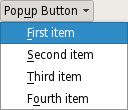
展示带弹出菜单的按钮在 融合 Widget 风格 .
另请参阅
PySide2.QtWidgets.QPushButton.
showMenu
(
)
展示 (弹出) 关联的弹出菜单。若没有这样的菜单,此函数什么都不做。此函数直到用户关闭弹出菜单后才返回。