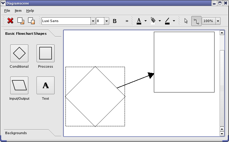
从查看构造函数开始:
MainWindow::MainWindow()
{
    createActions();
    createToolBox();
    createMenus();
    scene = new DiagramScene(itemMenu, this);
    scene->setSceneRect(QRectF(0, 0, 5000, 5000));
    connect(scene, &DiagramScene::itemInserted,
            this, &MainWindow::itemInserted);
    connect(scene, &DiagramScene::textInserted,
            this, &MainWindow::textInserted);
    connect(scene, &DiagramScene::itemSelected,
            this, &MainWindow::itemSelected);
    createToolbars();
    QHBoxLayout *layout = new QHBoxLayout;
    layout->addWidget(toolBox);
    view = new QGraphicsView(scene);
    layout->addWidget(view);
    QWidget *widget = new QWidget;
    widget->setLayout(layout);
    setCentralWidget(widget);
    setWindowTitle(tr("Diagramscene"));
    setUnifiedTitleAndToolBarOnMac(true);
}
In the constructor we call methods to create the widgets and layouts of the example before we create the diagram scene. The toolbars must be created after the scene as they connect to its signals. We then lay the widgets out in the window.
We connect to the
itemInserted()
and
textInserted()
slots of the diagram scenes as we want to uncheck the buttons in the tool box when an item is inserted. When an item is selected in the scene we receive the
itemSelected()
signal. We use this to update the widgets that display font properties if the item selected is a
DiagramTextItem
.
createToolBox()
function creates and lays out the widgets of the
toolBox
QToolBox
. We will not examine it with a high level of detail as it does not deal with graphics framework specific functionality. Here is its implementation:
void MainWindow::createToolBox()
{
    buttonGroup = new QButtonGroup(this);
    buttonGroup->setExclusive(false);
    connect(buttonGroup, QOverload<QAbstractButton *>::of(&QButtonGroup::buttonClicked),
            this, &MainWindow::buttonGroupClicked);
    QGridLayout *layout = new QGridLayout;
    layout->addWidget(createCellWidget(tr("Conditional"), DiagramItem::Conditional), 0, 0);
    layout->addWidget(createCellWidget(tr("Process"), DiagramItem::Step),0, 1);
    layout->addWidget(createCellWidget(tr("Input/Output"), DiagramItem::Io), 1, 0);
This part of the function sets up the tabbed widget item that contains the flowchart shapes. An exclusive
QButtonGroup
always keeps one button checked; we want the group to allow all buttons to be unchecked. We still use a button group since we can associate user data, which we use to store the diagram type, with each button. The
createCellWidget()
function sets up the buttons in the tabbed widget item and is examined later.
The buttons of the background tabbed widget item is set up in the same way, so we skip to the creation of the tool box:
    toolBox = new QToolBox;
    toolBox->setSizePolicy(QSizePolicy(QSizePolicy::Maximum, QSizePolicy::Ignored));
    toolBox->setMinimumWidth(itemWidget->sizeHint().width());
    toolBox->addItem(itemWidget, tr("Basic Flowchart Shapes"));
    toolBox->addItem(backgroundWidget, tr("Backgrounds"));
}
We set the preferred size of the toolbox as its maximum. This way, more space is given to the graphics view.
这里是
createActions()
函数:
void MainWindow::createActions()
{
    toFrontAction = new QAction(QIcon(":/images/bringtofront.png"),
                                tr("Bring to &Front"), this);
    toFrontAction->setShortcut(tr("Ctrl+F"));
    toFrontAction->setStatusTip(tr("Bring item to front"));
    connect(toFrontAction, &QAction::triggered, this, &MainWindow::bringToFront);
We show an example of the creation of an action. The functionality the actions trigger is discussed in the slots we connect the actions to. You can see the
application example
if you need a high-level introduction to actions.
The is the
createMenus()
函数:
void MainWindow::createMenus()
{
    fileMenu = menuBar()->addMenu(tr("&File"));
    fileMenu->addAction(exitAction);
    itemMenu = menuBar()->addMenu(tr("&Item"));
    itemMenu->addAction(deleteAction);
    itemMenu->addSeparator();
    itemMenu->addAction(toFrontAction);
    itemMenu->addAction(sendBackAction);
    aboutMenu = menuBar()->addMenu(tr("&Help"));
    aboutMenu->addAction(aboutAction);
}
We create the three menus’ of the example.
createToolbars()
function sets up the examples tool bars. The three
QToolButton
s in the
colorToolBar
,
fontColorToolButton
,
fillColorToolButton
,和
lineColorToolButton
, are interesting as we create icons for them by drawing on a
QPixmap
采用
QPainter
. We show how the
fillColorToolButton
is created. This button lets the user select a color for the diagram items.
void MainWindow::createToolbars()
{
    ...
    fillColorToolButton = new QToolButton;
    fillColorToolButton->setPopupMode(QToolButton::MenuButtonPopup);
    fillColorToolButton->setMenu(createColorMenu(SLOT(itemColorChanged()), Qt::white));
    fillAction = fillColorToolButton->menu()->defaultAction();
    fillColorToolButton->setIcon(createColorToolButtonIcon(
                                     ":/images/floodfill.png", Qt::white));
    connect(fillColorToolButton, &QAbstractButton::clicked,
            this, &MainWindow::fillButtonTriggered);
We set the menu of the tool button with
setMenu()
. We need the
fillAction
QAction
object to always be pointing to the selected action of the menu. The menu is created with the
createColorMenu()
function and, as we shall see later, contains one menu item for each color that the items can have. When the user presses the button, which trigger the
clicked()
signal, we can set the color of the selected item to the color of
fillAction
. It is with
createColorToolButtonIcon()
we create the icon for the button.
这里是
createBackgroundCellWidget()
函数:
QWidget *MainWindow::createBackgroundCellWidget(const QString &text, const QString &image)
{
    QToolButton *button = new QToolButton;
    button->setText(text);
    button->setIcon(QIcon(image));
    button->setIconSize(QSize(50, 50));
    button->setCheckable(true);
    backgroundButtonGroup->addButton(button);
    QGridLayout *layout = new QGridLayout;
    layout->addWidget(button, 0, 0, Qt::AlignHCenter);
    layout->addWidget(new QLabel(text), 1, 0, Qt::AlignCenter);
    QWidget *widget = new QWidget;
    widget->setLayout(layout);
    return widget;
}
This function creates
QWidget
s containing a tool button and a label. The widgets created with this function are used for the background tabbed widget item in the tool box.
这里是
createCellWidget()
函数:
QWidget *MainWindow::createCellWidget(const QString &text, DiagramItem::DiagramType type)
{
    DiagramItem item(type, itemMenu);
    QIcon icon(item.image());
    QToolButton *button = new QToolButton;
    button->setIcon(icon);
    button->setIconSize(QSize(50, 50));
    button->setCheckable(true);
    buttonGroup->addButton(button, int(type));
    QGridLayout *layout = new QGridLayout;
    layout->addWidget(button, 0, 0, Qt::AlignHCenter);
    layout->addWidget(new QLabel(text), 1, 0, Qt::AlignCenter);
    QWidget *widget = new QWidget;
    widget->setLayout(layout);
    return widget;
}
This function returns a
QWidget
包含
QToolButton
with an image of one of the
DiagramItems
, i.e., flowchart shapes. The image is created by the
DiagramItem
through the
image()
function. The
QButtonGroup
class lets us attach an id (int) with each button; we store the diagram’s type, i.e., the DiagramItem::DiagramType enum. We use the stored diagram type when we create new diagram items for the scene. The widgets created with this function is used in the tool box.
这里是
createColorMenu()
函数:
QMenu *MainWindow::createColorMenu(const char *slot, QColor defaultColor)
{
    QList<QColor> colors;
    colors << Qt::black << Qt::white << Qt::red << Qt::blue << Qt::yellow;
    QStringList names;
    names << tr("black") << tr("white") << tr("red") << tr("blue")
          << tr("yellow");
    QMenu *colorMenu = new QMenu(this);
    for (int i = 0; i < colors.count(); ++i) {
        QAction *action = new QAction(names.at(i), this);
        action->setData(colors.at(i));
        action->setIcon(createColorIcon(colors.at(i)));
        connect(action, SIGNAL(triggered()), this, slot);
        colorMenu->addAction(action);
        if (colors.at(i) == defaultColor)
            colorMenu->setDefaultAction(action);
    }
    return colorMenu;
}
This function creates a color menu that is used as the drop-down menu for the tool buttons in the
colorToolBar
. We create an action for each color that we add to the menu. We fetch the actions data when we set the color of items, lines, and text.
这里是
createColorToolButtonIcon()
函数:
QIcon MainWindow::createColorToolButtonIcon(const QString &imageFile, QColor color)
{
    QPixmap pixmap(50, 80);
    pixmap.fill(Qt::transparent);
    QPainter painter(&pixmap);
    QPixmap image(imageFile);
    // Draw icon centred horizontally on button.
    QRect target(4, 0, 42, 43);
    QRect source(0, 0, 42, 43);
    painter.fillRect(QRect(0, 60, 50, 80), color);
    painter.drawPixmap(target, image, source);
    return QIcon(pixmap);
}
This function is used to create the
QIcon
的
fillColorToolButton
,
fontColorToolButton
,和
lineColorToolButton
。
imageFile
string is either the text, flood-fill, or line symbol that is used for the buttons. Beneath the image we draw a filled rectangle using
color
.
这里是
createColorIcon()
函数:
QIcon MainWindow::createColorIcon(QColor color)
{
    QPixmap pixmap(20, 20);
    QPainter painter(&pixmap);
    painter.setPen(Qt::NoPen);
    painter.fillRect(QRect(0, 0, 20, 20), color);
    return QIcon(pixmap);
}
This function creates an icon with a filled rectangle in the color of
color
. It is used for creating icons for the color menus in the
fillColorToolButton
,
fontColorToolButton
,和
lineColorToolButton
.
这里是
backgroundButtonGroupClicked()
槽:
void MainWindow::backgroundButtonGroupClicked(QAbstractButton *button)
{
    const QList<QAbstractButton *> buttons = backgroundButtonGroup->buttons();
    for (QAbstractButton *myButton : buttons) {
        if (myButton != button)
            button->setChecked(false);
    }
    QString text = button->text();
    if (text == tr("Blue Grid"))
        scene->setBackgroundBrush(QPixmap(":/images/background1.png"));
    else if (text == tr("White Grid"))
        scene->setBackgroundBrush(QPixmap(":/images/background2.png"));
    else if (text == tr("Gray Grid"))
        scene->setBackgroundBrush(QPixmap(":/images/background3.png"));
    else
        scene->setBackgroundBrush(QPixmap(":/images/background4.png"));
    scene->update();
    view->update();
}
In this function we set the
QBrush
that is used to draw the background of the diagramscene. The background can be a grid of squares of blue, gray, or white tiles, or no grid at all. We have
QPixmap
s of the tiles from png files that we create the brush with.
When one of the buttons in the background tabbed widget item is clicked we change the brush; we find out which button it is by checking its text.
这里是实现为
buttonGroupClicked()
:
void MainWindow::buttonGroupClicked(QAbstractButton *button)
{
    const QList<QAbstractButton *> buttons = buttonGroup->buttons();
    for (QAbstractButton *myButton : buttons) {
        if (myButton != button)
            button->setChecked(false);
    }
    const int id = buttonGroup->id(button);
    if (id == InsertTextButton) {
        scene->setMode(DiagramScene::InsertText);
    } else {
        scene->setItemType(DiagramItem::DiagramType(id));
        scene->setMode(DiagramScene::InsertItem);
    }
}
This slot is called when a button in
buttonGroup
is checked. When a button is checked the user can click on the graphics view and a
DiagramItem
of the selected type will be inserted into the
DiagramScene
. We must loop through the buttons in the group to uncheck other buttons as only one button is allowed to be checked at a time.
QButtonGroup
assigns an id to each button. We have set the id of each button to the diagram type, as given by DiagramItem::DiagramType that will be inserted into the scene when it is clicked. We can then use the button id when we set the diagram type with
setItemType()
. In the case of text we assigned an id that has a value that is not in the DiagramType enum.
这里是实现为
deleteItem()
:
void MainWindow::deleteItem()
{
    QList<QGraphicsItem *> selectedItems = scene->selectedItems();
    for (QGraphicsItem *item : qAsConst(selectedItems)) {
        if (item->type() == Arrow::Type) {
            scene->removeItem(item);
            Arrow *arrow = qgraphicsitem_cast<Arrow *>(item);
            arrow->startItem()->removeArrow(arrow);
            arrow->endItem()->removeArrow(arrow);
            delete item;
        }
    }
    selectedItems = scene->selectedItems();
    for (QGraphicsItem *item : qAsConst(selectedItems)) {
         if (item->type() == DiagramItem::Type)
             qgraphicsitem_cast<DiagramItem *>(item)->removeArrows();
         scene->removeItem(item);
         delete item;
     }
}
This slot deletes the selected item, if any, from the scene. It deletes the arrows first in order to avoid to delete them twice. If the item to be deleted is a
DiagramItem
, we also need to delete arrows connected to it; we don’t want arrows in the scene that aren’t connected to items in both ends.
This is the implementation of pointerGroupClicked():
void MainWindow::pointerGroupClicked()
{
    scene->setMode(DiagramScene::Mode(pointerTypeGroup->checkedId()));
}
pointerTypeGroup
decides whether the scene is in ItemMove or InsertLine mode. This button group is exclusive, i.e., only one button is checked at any time. As with the
buttonGroup
above we have assigned an id to the buttons that matches values of the DiagramScene::Mode enum, so that we can use the id to set the correct mode.
这里是
bringToFront()
槽:
void MainWindow::bringToFront()
{
    if (scene->selectedItems().isEmpty())
        return;
    QGraphicsItem *selectedItem = scene->selectedItems().first();
    const QList<QGraphicsItem *> overlapItems = selectedItem->collidingItems();
    qreal zValue = 0;
    for (const QGraphicsItem *item : overlapItems) {
        if (item->zValue() >= zValue && item->type() == DiagramItem::Type)
            zValue = item->zValue() + 0.1;
    }
    selectedItem->setZValue(zValue);
}
Several items may collide, i.e., overlap, with each other in the scene. This slot is called when the user requests that an item should be placed on top of the items it collides with.
QGrapicsItems
have a z-value that decides the order in which items are stacked in the scene; you can think of it as the z-axis in a 3D coordinate system. When items collide the items with higher z-values will be drawn on top of items with lower values. When we bring an item to the front we can loop through the items it collides with and set a z-value that is higher than all of them.
这里是
sendToBack()
槽:
void MainWindow::sendToBack()
{
    if (scene->selectedItems().isEmpty())
        return;
    QGraphicsItem *selectedItem = scene->selectedItems().first();
    const QList<QGraphicsItem *> overlapItems = selectedItem->collidingItems();
    qreal zValue = 0;
    for (const QGraphicsItem *item : overlapItems) {
        if (item->zValue() <= zValue && item->type() == DiagramItem::Type)
            zValue = item->zValue() - 0.1;
    }
    selectedItem->setZValue(zValue);
}
This slot works in the same way as
bringToFront()
described above, but sets a z-value that is lower than items the item that should be send to the back collides with.
This is the implementation of
itemInserted()
:
void MainWindow::itemInserted(DiagramItem *item)
{
    pointerTypeGroup->button(int(DiagramScene::MoveItem))->setChecked(true);
    scene->setMode(DiagramScene::Mode(pointerTypeGroup->checkedId()));
    buttonGroup->button(int(item->diagramType()))->setChecked(false);
}
This slot is called from the
DiagramScene
when an item has been added to the scene. We set the mode of the scene back to the mode before the item was inserted, which is ItemMove or InsertText depending on which button is checked in the
pointerTypeGroup
. We must also uncheck the button in the in the
buttonGroup
.
这里是实现为
textInserted()
:
void MainWindow::textInserted(QGraphicsTextItem *)
{
    buttonGroup->button(InsertTextButton)->setChecked(false);
    scene->setMode(DiagramScene::Mode(pointerTypeGroup->checkedId()));
}
We simply set the mode of the scene back to the mode it had before the text was inserted.
这里是
currentFontChanged()
槽:
void MainWindow::currentFontChanged(const QFont &)
{
    handleFontChange();
}
When the user requests a font change, by using one of the widgets in the
fontToolBar
, we create a new
QFont
object and set its properties to match the state of the widgets. This is done in
handleFontChange()
, so we simply call that slot.
这里是
fontSizeChanged()
槽:
void MainWindow::fontSizeChanged(const QString &)
{
    handleFontChange();
}
When the user requests a font change, by using one of the widgets in the
fontToolBar
, we create a new
QFont
object and set its properties to match the state of the widgets. This is done in
handleFontChange()
, so we simply call that slot.
这里是实现为
sceneScaleChanged()
:
void MainWindow::sceneScaleChanged(const QString &scale)
{
    double newScale = scale.left(scale.indexOf(tr("%"))).toDouble() / 100.0;
    QTransform oldMatrix = view->transform();
    view->resetTransform();
    view->translate(oldMatrix.dx(), oldMatrix.dy());
    view->scale(newScale, newScale);
}
The user can increase or decrease the scale, with the
sceneScaleCombo
, the scene is drawn in. It is not the scene itself that changes its scale, but only the view.
这里是
textColorChanged()
槽:
void MainWindow::textColorChanged()
{
    textAction = qobject_cast<QAction *>(sender());
    fontColorToolButton->setIcon(createColorToolButtonIcon(
                                     ":/images/textpointer.png",
                                     qvariant_cast<QColor>(textAction->data())));
    textButtonTriggered();
}
This slot is called when an item in the drop-down menu of the
fontColorToolButton
is pressed. We need to change the icon on the button to the color of the selected
QAction
. We keep a pointer to the selected action in
textAction
. It is in
textButtonTriggered()
we change the text color to the color of
textAction
, so we call that slot.
这里是
itemColorChanged()
implementation:
void MainWindow::itemColorChanged()
{
    fillAction = qobject_cast<QAction *>(sender());
    fillColorToolButton->setIcon(createColorToolButtonIcon(
                                     ":/images/floodfill.png",
                                     qvariant_cast<QColor>(fillAction->data())));
    fillButtonTriggered();
}
This slot handles requests for changing the color of
DiagramItems
in the same manner as
textColorChanged()
does for
DiagramTextItems
.
这里是实现为
lineColorChanged()
:
void MainWindow::lineColorChanged()
{
    lineAction = qobject_cast<QAction *>(sender());
    lineColorToolButton->setIcon(createColorToolButtonIcon(
                                     ":/images/linecolor.png",
                                     qvariant_cast<QColor>(lineAction->data())));
    lineButtonTriggered();
}
This slot handles requests for changing the color of
Arrows
in the same manner that
textColorChanged()
does it for
DiagramTextItems
.
这里是
textButtonTriggered()
槽:
void MainWindow::textButtonTriggered()
{
    scene->setTextColor(qvariant_cast<QColor>(textAction->data()));
}
textAction
points to the
QAction
of the currently selected menu item in the
fontColorToolButton
‘s color drop-down menu. We have set the data of the action to the
QColor
the action represents, so we can simply fetch this when we set the color of text with
setTextColor()
.
这里是
fillButtonTriggered()
槽:
void MainWindow::fillButtonTriggered()
{
    scene->setItemColor(qvariant_cast<QColor>(fillAction->data()));
}
fillAction
points to the selected menu item in the drop-down menu of
fillColorToolButton()
. We can therefore use the data of this action when we set the item color with
setItemColor()
.
这里是
lineButtonTriggered()
槽:
void MainWindow::lineButtonTriggered()
{
    scene->setLineColor(qvariant_cast<QColor>(lineAction->data()));
}
lineAction
point to the selected item in the drop-down menu of
lineColorToolButton
. We use its data when we set the arrow color with
setLineColor()
.
这里是
handleFontChange()
函数:
void MainWindow::handleFontChange()
{
    QFont font = fontCombo->currentFont();
    font.setPointSize(fontSizeCombo->currentText().toInt());
    font.setWeight(boldAction->isChecked() ? QFont::Bold : QFont::Normal);
    font.setItalic(italicAction->isChecked());
    font.setUnderline(underlineAction->isChecked());
    scene->setFont(font);
}
handleFontChange()
is called when any of the widgets that show font properties changes. We create a new
QFont
object and set its properties based on the widgets. We then call the
setFont()
function of
DiagramScene
; it is the scene that set the font of the
DiagramTextItems
it manages.
这里是
itemSelected()
槽:
void MainWindow::itemSelected(QGraphicsItem *item)
{
    DiagramTextItem *textItem =
    qgraphicsitem_cast<DiagramTextItem *>(item);
    QFont font = textItem->font();
    fontCombo->setCurrentFont(font);
    fontSizeCombo->setEditText(QString().setNum(font.pointSize()));
    boldAction->setChecked(font.weight() == QFont::Bold);
    italicAction->setChecked(font.italic());
    underlineAction->setChecked(font.underline());
}
This slot is called when an item in the
DiagramScene
is selected. In the case of this example it is only text items that emit signals when they are selected, so we do not need to check what kind of graphics
item
is.
We set the state of the widgets to match the properties of the font of the selected text item.
This is the
about()
槽:
void MainWindow::about()
{
    QMessageBox::about(this, tr("About Diagram Scene"),
                       tr("The <b>Diagram Scene</b> example shows "
                          "use of the graphics framework."));
}
This slot displays an about box for the example when the user selects the about menu item from the help menu.