MainWindow::MainWindow(QWidget *parent)
: QMainWindow(parent)
{
QWidget *centralWidget = new QWidget(this);
setCentralWidget(centralWidget);
createActions();
QGridLayout *mainLayout = new QGridLayout(centralWidget);
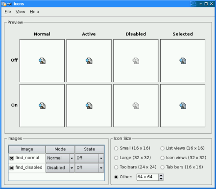
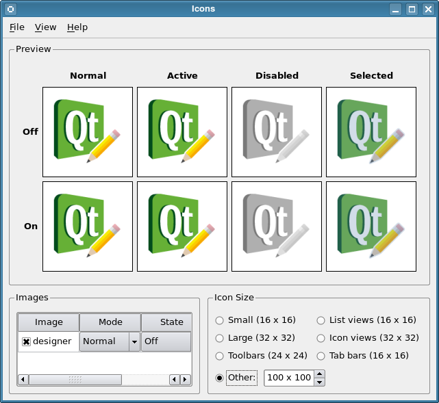
QGroupBox *previewGroupBox = new QGroupBox(tr("Preview"));
previewArea = new IconPreviewArea(previewGroupBox);
QVBoxLayout *previewLayout = new QVBoxLayout(previewGroupBox);
previewLayout->addWidget(previewArea);
mainLayout->addWidget(previewGroupBox, 0, 0, 1, 2);
mainLayout->addWidget(createImagesGroupBox(), 1, 0);
QVBoxLayout *vBox = new QVBoxLayout;
vBox->addWidget(createIconSizeGroupBox());
vBox->addWidget(createHighDpiIconSizeGroupBox());
vBox->addItem(new QSpacerItem(0, 0, QSizePolicy::Ignored, QSizePolicy::MinimumExpanding));
mainLayout->addLayout(vBox, 1, 1);
createContextMenu();
setWindowTitle(tr("Icons"));
checkCurrentStyle();
sizeButtonGroup->button(OtherSize)->click();
}
In the constructor we first create the main window’s central widget and its child widgets, and put them in a grid layout. Then we create the menus with their associated entries and actions.
We set the window title and determine the current style for the application. We also enable the icon size spin box by clicking the associated radio button, making the current value of the spin box the icon’s initial size.
void MainWindow::about()
{
    QMessageBox::about(this, tr("About Icons"),
            tr("The <b>Icons</b> example illustrates how Qt renders an icon in "
               "different modes (active, normal, disabled, and selected) and "
               "states (on and off) based on a set of images."));
}
about()
slot displays a message box using the static
about()
function. In this example it displays a simple box with information about the example.
about()
function looks for a suitable icon in four locations: It prefers its parent’s icon if that exists. If it doesn’t, the function tries the top-level widget containing parent, and if that fails, it tries the active window. As a last resort it uses the
QMessageBox
‘s Information icon.
void MainWindow::changeStyle(bool checked)
{
    if (!checked)
        return;
    const QAction *action = qobject_cast<QAction *>(sender());
在
changeStyle()
slot we first check the slot’s parameter. If it is false we immediately return, otherwise we find out which style to change to, i.e. which action that triggered the slot, using the
sender()
函数。
This function returns the sender as a
QObject
pointer. Since we know that the sender is a
QAction
object, we can safely cast the
QObject
. We could have used a C-style cast or a C++
static_cast()
, but as a defensive programming technique we use a
qobject_cast()
. The advantage is that if the object has the wrong type, a null pointer is returned. Crashes due to null pointers are much easier to diagnose than crashes due to unsafe casts.
    QStyle *style = QStyleFactory::create(action->data().toString());
    Q_ASSERT(style);
    QApplication::setStyle(style);
    const QList<QAbstractButton*> buttons = sizeButtonGroup->buttons();
    for (QAbstractButton *button : buttons) {
        const QStyle::PixelMetric metric = static_cast<QStyle::PixelMetric>(sizeButtonGroup->id(button));
        const int value = style->pixelMetric(metric);
        switch (metric) {
        case QStyle::PM_SmallIconSize:
            button->setText(tr("Small (%1 x %1)").arg(value));
            break;
        case QStyle::PM_LargeIconSize:
            button->setText(tr("Large (%1 x %1)").arg(value));
            break;
        case QStyle::PM_ToolBarIconSize:
            button->setText(tr("Toolbars (%1 x %1)").arg(value));
            break;
        case QStyle::PM_ListViewIconSize:
            button->setText(tr("List views (%1 x %1)").arg(value));
            break;
        case QStyle::PM_IconViewIconSize:
            button->setText(tr("Icon views (%1 x %1)").arg(value));
            break;
        case QStyle::PM_TabBarIconSize:
            button->setText(tr("Tab bars (%1 x %1)").arg(value));
            break;
        default:
            break;
        }
    }
    triggerChangeSize();
}
Once we have the action, we extract the style name using
data()
. Then we create a
QStyle
object using the static
create()
函数。
Although we can assume that the style is supported by the
QStyleFactory
: To be on the safe side, we use the
Q_ASSERT()
macro to check if the created style is valid before we use the
setStyle()
function to set the application’s GUI style to the new style.
QApplication
will automatically delete the style object when a new style is set or when the application exits.
The predefined icon size options provided in the application are style dependent, so we need to update the labels in the icon size group box and in the end call the
changeSize()
slot to update the icon’s size.
void MainWindow::changeSize(int id, bool checked)
{
    if (!checked)
        return;
    const bool other = id == int(OtherSize);
    const int extent = other
        ? otherSpinBox->value()
        : QApplication::style()->pixelMetric(static_cast<QStyle::PixelMetric>(id));
    previewArea->setSize(QSize(extent, extent));
    otherSpinBox->setEnabled(other);
}
void MainWindow::triggerChangeSize()
{
    changeSize(sizeButtonGroup->checkedId(), true);
}
changeSize()
slot sets the size for the preview area’s icon.
It is invoked by the
QButtonGroup
whose members are radio buttons for controlling the icon size. In
createIconSizeGroupBox()
, each button is assigned a
PixelMetric
value as an id, which is passed as a parameter to the slot.
The special value
OtherSize
indicates that the spin box is enabled. If it is, we extract the extent of the new size from the box. If it’s not, we query the style for the metric. Then we create a
QSize
object based on the extent, and use that object to set the size of the preview area’s icon.
void MainWindow::addImages(const QString &directory)
{
    QFileDialog fileDialog(this, tr("Open Images"), directory);
    QStringList mimeTypeFilters;
    const QList<QByteArray> mimeTypes = QImageReader::supportedMimeTypes();
    for (const QByteArray &mimeTypeName : mimeTypes)
        mimeTypeFilters.append(mimeTypeName);
    mimeTypeFilters.sort();
    fileDialog.setMimeTypeFilters(mimeTypeFilters);
    fileDialog.selectMimeTypeFilter(QLatin1String("image/png"));
    fileDialog.setAcceptMode(QFileDialog::AcceptOpen);
    fileDialog.setFileMode(QFileDialog::ExistingFiles);
    if (!nativeFileDialogAct->isChecked())
        fileDialog.setOption(QFileDialog::DontUseNativeDialog);
    if (fileDialog.exec() == QDialog::Accepted)
        loadImages(fileDialog.selectedFiles());
函数
addImages()
is called by the slot addSampleImages() passing the samples directory, or by the slot addOtherImages() passing the directory obtained by querying
standardLocations()
.
The first thing we do is to show a file dialog to the user. We initialize it to show the filters returned by
supportedMimeTypes()
.
For each of the files the file dialog returns, we add a row to the table widget. The table widget is listing the images the user has loaded into the application.
const QFileInfo fileInfo(fileName);
const QString imageName = fileInfo.baseName();
const QString fileName2x = fileInfo.absolutePath()
    + QLatin1Char('/') + imageName + QLatin1String("@2x.") + fileInfo.suffix();
const QFileInfo fileInfo2x(fileName2x);
const QImage image(fileName);
const QString toolTip =
    tr("Directory: %1\nFile: %2\nFile@2x: %3\nSize: %4x%5")
       .arg(QDir::toNativeSeparators(fileInfo.absolutePath()), fileInfo.fileName())
       .arg(fileInfo2x.exists() ? fileInfo2x.fileName() : tr("<None>"))
       .arg(image.width()).arg(image.height());
QTableWidgetItem *fileItem = new QTableWidgetItem(imageName);
fileItem->setData(Qt::UserRole, fileName);
fileItem->setIcon(QPixmap::fromImage(image));
fileItem->setFlags((fileItem->flags() | Qt::ItemIsUserCheckable) & ~Qt::ItemIsEditable);
fileItem->setToolTip(toolTip);
We retrieve the image name using the
baseName()
function that returns the base name of the file without the path, and create the first table widget item in the row. We check if a high resolution version of the image exists (identified by the suffix
@2x
on the base name) and display that along with the size in the tooltip.
We add the file’s complete name to the item’s data. Since an item can hold several information pieces, we need to assign the file name a role that will distinguish it from other data. This role can be
UserRole
or any value above it.
We also make sure that the item is not editable by removing the
ItemIsEditable
flag. Table items are editable by default.
QIcon::Mode mode = QIcon::Normal;
QIcon::State state = QIcon::Off;
if (guessModeStateAct->isChecked()) {
    if (imageName.contains(QLatin1String("_act"), Qt::CaseInsensitive))
        mode = QIcon::Active;
    else if (imageName.contains(QLatin1String("_dis"), Qt::CaseInsensitive))
        mode = QIcon::Disabled;
    else if (imageName.contains(QLatin1String("_sel"), Qt::CaseInsensitive))
        mode = QIcon::Selected;
    if (imageName.contains(QLatin1String("_on"), Qt::CaseInsensitive))
        state = QIcon::On;
Then we create the second and third items in the row making the default mode Normal and the default state Off. But if the Guess Image Mode/State option is checked, and the file name contains “_act”, “_dis”, or “_sel”, the modes are changed to Active, Disabled, or Selected. And if the file name contains “_on”, the state is changed to On. The sample files in the example’s
images
subdirectory respect this naming convention.
imagesTable->setItem(row, 0, fileItem);
QTableWidgetItem *modeItem =
    new QTableWidgetItem(IconPreviewArea::iconModeNames().at(IconPreviewArea::iconModes().indexOf(mode)));
modeItem->setToolTip(toolTip);
imagesTable->setItem(row, 1, modeItem);
QTableWidgetItem *stateItem =
    new QTableWidgetItem(IconPreviewArea::iconStateNames().at(IconPreviewArea::iconStates().indexOf(state)));
stateItem->setToolTip(toolTip);
imagesTable->setItem(row, 2, stateItem);
imagesTable->openPersistentEditor(modeItem);
imagesTable->openPersistentEditor(stateItem);
fileItem->setCheckState(Qt::Checked);
In the end we add the items to the associated row, and use the
openPersistentEditor()
function to create comboboxes for the mode and state columns of the items.
Due to the connection between the table widget’s
itemChanged()
signal and the
changeIcon()
slot, the new image is automatically converted into a pixmap and made part of the set of pixmaps available to the icon in the preview area. So, corresponding to this fact, we need to make sure that the new image’s check box is enabled.
void MainWindow::changeIcon()
{
    QIcon icon;
    for (int row = 0; row < imagesTable->rowCount(); ++row) {
        const QTableWidgetItem *fileItem = imagesTable->item(row, 0);
        const QTableWidgetItem *modeItem = imagesTable->item(row, 1);
        const QTableWidgetItem *stateItem = imagesTable->item(row, 2);
        if (fileItem->checkState() == Qt::Checked) {
            const int modeIndex = IconPreviewArea::iconModeNames().indexOf(modeItem->text());
            Q_ASSERT(modeIndex >= 0);
            const int stateIndex = IconPreviewArea::iconStateNames().indexOf(stateItem->text());
            Q_ASSERT(stateIndex >= 0);
            const QIcon::Mode mode = IconPreviewArea::iconModes().at(modeIndex);
            const QIcon::State state = IconPreviewArea::iconStates().at(stateIndex);
changeIcon()
slot is called when the user alters the set of images listed in the
QTableWidget
, to update the
QIcon
object rendered by the
IconPreviewArea
.
We first create a
QIcon
object, and then we run through the
QTableWidget
, which lists the images the user has loaded into the application.
const QString fileName = fileItem->data(Qt::UserRole).toString();
QImage image(fileName);
if (!image.isNull())
    icon.addPixmap(QPixmap::fromImage(image), mode, state);
We also extract the image file’s name using the
data()
function. This function takes a Qt::DataItemRole as an argument to retrieve the right data (remember that an item can hold several pieces of information) and returns it as a
QVariant
. Then we use the
toString()
function to get the file name as a
QString
.
To create a pixmap from the file, we need to first create an image and then convert this image into a pixmap using
fromImage()
. Once we have the final pixmap, we add it, with its associated mode and state, to the
QIcon
‘s set of available pixmaps.
previewArea->setIcon(icon);
After running through the entire list of images, we change the icon of the preview area to the one we just created.
void MainWindow::removeAllImages()
{
    imagesTable->setRowCount(0);
    changeIcon();
}
在
removeAllImages()
slot, we simply set the table widget’s row count to zero, automatically removing all the images the user has loaded into the application. Then we update the set of pixmaps available to the preview area’s icon using the
changeIcon()
槽。
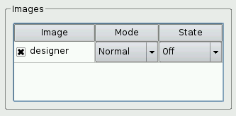
createImagesGroupBox()
function is implemented to simplify the constructor. The main purpose of the function is to create a
QTableWidget
that will keep track of the images the user has loaded into the application.
QWidget *MainWindow::createImagesGroupBox()
{
    QGroupBox *imagesGroupBox = new QGroupBox(tr("Images"));
    imagesTable = new QTableWidget;
    imagesTable->setSelectionMode(QAbstractItemView::NoSelection);
    imagesTable->setItemDelegate(new ImageDelegate(this));
First we create a group box that will contain the table widget. Then we create a
QTableWidget
and customize it to suit our purposes.
We call
setSelectionMode()
to prevent the user from selecting items.
setItemDelegate()
call sets the item delegate for the table widget. We create a
ImageDelegate
that we make the item delegate for our view.
QStyledItemDelegate
class can be used to provide an editor for an item view class that is subclassed from
QAbstractItemView
. Using a delegate for this purpose allows the editing mechanism to be customized and developed independently from the model and view.
In this example we derive
ImageDelegate
from
QStyledItemDelegate
.
QStyledItemDelegate
usually provides line editors, while our subclass
ImageDelegate
, provides comboboxes for the mode and state fields.
const QStringList labels({tr("Image"), tr("Mode"), tr("State")});
imagesTable->horizontalHeader()->setDefaultSectionSize(90);
imagesTable->setColumnCount(3);
imagesTable->setHorizontalHeaderLabels(labels);
imagesTable->horizontalHeader()->setSectionResizeMode(0, QHeaderView::Stretch);
imagesTable->horizontalHeader()->setSectionResizeMode(1, QHeaderView::Fixed);
imagesTable->horizontalHeader()->setSectionResizeMode(2, QHeaderView::Fixed);
imagesTable->verticalHeader()->hide();
Then we customize the
QTableWidget
‘s horizontal header, and hide the vertical header.
connect(imagesTable, &QTableWidget::itemChanged,
        this, &MainWindow::changeIcon);
QVBoxLayout *layout = new QVBoxLayout(imagesGroupBox);
layout->addWidget(imagesTable);
return imagesGroupBox;
At the end, we connect the
itemChanged()
signal to the
changeIcon()
slot to ensure that the preview area is in sync with the image table.
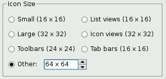
createIconSizeGroupBox()
function is called from the constructor. It creates the widgets controlling the size of the preview area’s icon.
QWidget *MainWindow::createIconSizeGroupBox()
{
    QGroupBox *iconSizeGroupBox = new QGroupBox(tr("Icon Size"));
    sizeButtonGroup = new QButtonGroup(this);
    sizeButtonGroup->setExclusive(true);
    connect(sizeButtonGroup, QOverload<int, bool>::of(&QButtonGroup::buttonToggled),
            this, &MainWindow::changeSize);
    QRadioButton *smallRadioButton = new QRadioButton;
    sizeButtonGroup->addButton(smallRadioButton, QStyle::PM_SmallIconSize);
    QRadioButton *largeRadioButton = new QRadioButton;
    sizeButtonGroup->addButton(largeRadioButton, QStyle::PM_LargeIconSize);
    QRadioButton *toolBarRadioButton = new QRadioButton;
    sizeButtonGroup->addButton(toolBarRadioButton, QStyle::PM_ToolBarIconSize);
    QRadioButton *listViewRadioButton = new QRadioButton;
    sizeButtonGroup->addButton(listViewRadioButton, QStyle::PM_ListViewIconSize);
    QRadioButton *iconViewRadioButton = new QRadioButton;
    sizeButtonGroup->addButton(iconViewRadioButton, QStyle::PM_IconViewIconSize);
    QRadioButton *tabBarRadioButton = new QRadioButton;
    sizeButtonGroup->addButton(tabBarRadioButton, QStyle::PM_TabBarIconSize);
    QRadioButton *otherRadioButton = new QRadioButton(tr("Other:"));
    sizeButtonGroup->addButton(otherRadioButton, OtherSize);
    otherSpinBox = new IconSizeSpinBox;
    otherSpinBox->setRange(8, 256);
    const QString spinBoxToolTip =
        tr("Enter a custom size within %1..%2")
           .arg(otherSpinBox->minimum()).arg(otherSpinBox->maximum());
    otherSpinBox->setValue(64);
    otherSpinBox->setToolTip(spinBoxToolTip);
    otherRadioButton->setToolTip(spinBoxToolTip);
First we create a group box that will contain all the widgets; then we create the radio buttons and the spin box. We add the radio buttons to an instance of
QButtonGroup
, using the value of the
PixelMetric
they represent as an integer id.
enum { OtherSize = QStyle::PM_CustomBase };
We introduce an enumeration constant
OtherSize
to represent a custom size.
The spin box is not a regular
QSpinBox
but an
IconSizeSpinBox
。
IconSizeSpinBox
类继承
QSpinBox
and reimplements two functions:
textFromValue()
and
valueFromText()
。
IconSizeSpinBox
is designed to handle icon sizes, e.g., “32 x 32”, instead of plain integer values.
connect(otherSpinBox, QOverload<int>::of(&QSpinBox::valueChanged),
        this, &MainWindow::triggerChangeSize);
QHBoxLayout *otherSizeLayout = new QHBoxLayout;
otherSizeLayout->addWidget(otherRadioButton);
otherSizeLayout->addWidget(otherSpinBox);
otherSizeLayout->addStretch();
QGridLayout *layout = new QGridLayout(iconSizeGroupBox);
layout->addWidget(smallRadioButton, 0, 0);
layout->addWidget(largeRadioButton, 1, 0);
layout->addWidget(toolBarRadioButton, 2, 0);
layout->addWidget(listViewRadioButton, 0, 1);
layout->addWidget(iconViewRadioButton, 1, 1);
layout->addWidget(tabBarRadioButton, 2, 1);
layout->addLayout(otherSizeLayout, 3, 0, 1, 2);
layout->setRowStretch(4, 1);
return iconSizeGroupBox;
Then we connect all of the radio buttons
toggled()
signals and the spin box’s
valueChanged()
signal to the
changeSize()
slot to make sure that the size of the preview area’s icon is updated whenever the user changes the icon size. In the end we put the widgets in a layout that we install on the group box.
void MainWindow::createActions()
{
QMenu *fileMenu = menuBar()->addMenu(tr("&File"));
addSampleImagesAct = new QAction(tr("Add &Sample Images..."), this);
addSampleImagesAct->setShortcut(tr("Ctrl+A"));
connect(addSampleImagesAct, &QAction::triggered, this, &MainWindow::addSampleImages);
fileMenu->addAction(addSampleImagesAct);
addOtherImagesAct = new QAction(tr("&Add Images..."), this);
addOtherImagesAct->setShortcut(QKeySequence::Open);
connect(addOtherImagesAct, &QAction::triggered, this, &MainWindow::addOtherImages);
fileMenu->addAction(addOtherImagesAct);
removeAllImagesAct = new QAction(tr("&Remove All Images"), this);
removeAllImagesAct->setShortcut(tr("Ctrl+R"));
connect(removeAllImagesAct, &QAction::triggered,
this, &MainWindow::removeAllImages);
fileMenu->addAction(removeAllImagesAct);
fileMenu->addSeparator();
QAction *exitAct = fileMenu->addAction(tr("&Quit"), this, &QWidget::close);
exitAct->setShortcuts(QKeySequence::Quit);
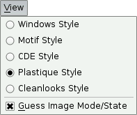
QMenu *viewMenu = menuBar()->addMenu(tr("&View"));
styleActionGroup = new QActionGroup(this);
const QStringList styleKeys = QStyleFactory::keys();
for (const QString &styleName : styleKeys) {
QAction *action = new QAction(tr("%1 Style").arg(styleName), styleActionGroup);
action->setData(styleName);
action->setCheckable(true);
connect(action, &QAction::triggered, this, &MainWindow::changeStyle);
viewMenu->addAction(action);
}
QMenu *settingsMenu = menuBar()->addMenu(tr("&Settings"));
guessModeStateAct = new QAction(tr("&Guess Image Mode/State"), this);
guessModeStateAct->setCheckable(true);
guessModeStateAct->setChecked(true);
settingsMenu->addAction(guessModeStateAct);
nativeFileDialogAct = new QAction(tr("&Use Native File Dialog"), this);
nativeFileDialogAct->setCheckable(true);
nativeFileDialogAct->setChecked(true);
settingsMenu->addAction(nativeFileDialogAct);
QMenu *helpMenu = menuBar()->addMenu(tr("&Help"));
helpMenu->addAction(tr("&About"), this, &MainWindow::about);
helpMenu->addAction(tr("About &Qt"), qApp, &QApplication::aboutQt);
}
在
createActions()
function we create and customize all the actions needed to implement the functionality associated with the menu entries in the application.
In particular we create the
styleActionGroup
based on the currently available GUI styles using
QStyleFactory
.
keys()
returns a list of valid keys, typically including “windows” and “fusion”. Depending on the platform, “windowsvista” and “macintosh” may be available.
We create one action for each key, and adds the action to the action group. Also, for each action, we call
setData()
with the style name. We will retrieve it later using
data()
.
As we go along, we create the File, View and Help menus and add the actions to them.
QMenu
class provides a menu widget for use in menu bars, context menus, and other popup menus. We put each menu in the application’s menu bar, which we retrieve using
menuBar()
.
void MainWindow::createContextMenu()
{
    imagesTable->setContextMenuPolicy(Qt::ActionsContextMenu);
    imagesTable->addAction(addSampleImagesAct);
    imagesTable->addAction(addOtherImagesAct);
    imagesTable->addAction(removeAllImagesAct);
}
QWidgets have a
contextMenuPolicy
property that controls how the widget should behave when the user requests a context menu (e.g., by right-clicking). We set the
QTableWidget
‘s context menu policy to
ActionsContextMenu
, meaning that the
QAction
s associated with the widget should appear in its context menu.
Then we add the Add Image and Remove All Images actions to the table widget. They will then appear in the table widget’s context menu.
void MainWindow::checkCurrentStyle()
{
    const QList<QAction *> actions = styleActionGroup->actions();
    for (QAction *action : actions) {
        const QString styleName = action->data().toString();
        const std::unique_ptr<QStyle> candidate{QStyleFactory::create(styleName)};
        Q_ASSERT(candidate);
        if (candidate->metaObject()->className()
                == QApplication::style()->metaObject()->className()) {
            action->trigger();
            return;
        }
    }
}
在
checkCurrentStyle()
function we go through the group of style actions, looking for the current GUI style.
For each action, we first extract the style name using
data()
. Since this is only a
QStyleFactory
key (e.g., “macintosh”), we cannot compare it directly to the current style’s class name. We need to create a
QStyle
object using the static
create()
function and compare the class name of the created
QStyle
object with that of the current style. As soon as we are done with a
QStyle
candidate, we delete it.
For all
QObject
subclasses that use the
Q_OBJECT
macro, the class name of an object is available through its
元对象
.
We can assume that the style is supported by
QStyleFactory
, but to be on the safe side we use the
Q_ASSERT()
macro to make sure that
create()
returned a valid pointer.
void MainWindow::show()
{
    QMainWindow::show();
    connect(windowHandle(), &QWindow::screenChanged, this, &MainWindow::screenChanged);
    screenChanged();
}
We overload the show() function to set up the updating of the current screen in
screenChanged()
. After calling
show()
,
QWindow
associated with the
QWidget
is created and we can connect to its
screenChanged()
信号。
 class MainWindow : public QMainWindow { Q_OBJECT public: MainWindow(QWidget *parent = nullptr); void loadImages(const QStringList &fileNames); void show(); private slots: void about(); void changeStyle(bool checked); void changeSize(int, bool); void triggerChangeSize(); void changeIcon(); void addSampleImages(); void addOtherImages(); void removeAllImages(); void useHighDpiPixmapsChanged(int checkState); void screenChanged(); private: QWidget *createImagesGroupBox(); QWidget *createIconSizeGroupBox(); QWidget *createHighDpiIconSizeGroupBox(); void createActions(); void createContextMenu(); void checkCurrentStyle(); void addImages(const QString &directory); IconPreviewArea *previewArea; QTableWidget *imagesTable; QButtonGroup *sizeButtonGroup; IconSizeSpinBox *otherSpinBox; QLabel *devicePixelRatioLabel; QLabel *screenNameLabel; QAction *addOtherImagesAct; QAction *addSampleImagesAct; QAction *removeAllImagesAct; QAction *guessModeStateAct; QAction *nativeFileDialogAct; QActionGroup *styleActionGroup; };