组框范例展示如何在 Qt 中使用不同种类的组框。
Group boxes are container widgets that organize buttons into groups, both logically and on screen. They manage the interactions between the user and the application so that you do not have to enforce simple constraints.
Group boxes are usually used to organize check boxes and radio buttons into exclusive groups.
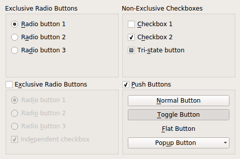
The Group Boxes example consists of a single
Windowclass that is used to show four group boxes: an exclusive radio button group, a non-exclusive checkbox group, an exclusive radio button group with an enabling checkbox, and a group box with normal push buttons.
Window类是子类化的QWidgetthat is used to display a number of group boxes. The class definition contains functions to construct each group box and populate it with different selections of button widgets:class Window : public QWidget { Q_OBJECT public: Window(QWidget *parent = nullptr); private: QGroupBox *createFirstExclusiveGroup(); QGroupBox *createSecondExclusiveGroup(); QGroupBox *createNonExclusiveGroup(); QGroupBox *createPushButtonGroup(); };In the example, the widget will be used as a top-level window, so the constructor is defined so that we do not have to specify a parent widget.
The constructor creates a grid layout and fills it with each of the group boxes that are to be displayed:
def __init__(self, parent = None):
    QWidget.__init__(self, parent)
    grid = QGridLayout()
    grid.addWidget(createFirstExclusiveGroup(), 0, 0)
    grid.addWidget(createSecondExclusiveGroup(), 1, 0)
    grid.addWidget(createNonExclusiveGroup(), 0, 1)
    grid.addWidget(createPushButtonGroup(), 1, 1)
    setLayout(grid)
    setWindowTitle("Group Boxes")
    resize(480, 320)
The functions used to create each group box each return a
QGroupBoxto be inserted into the grid layout.def createFirstExclusiveGroup(self): groupBox = QGroupBox("Exclusive Radio Buttons") radio1 = QRadioButton("&Radio button 1") radio2 = QRadioButton("R&adio button 2") radio3 = QRadioButton("Ra&dio button 3") radio1.setChecked(True)The first group box contains and manages three radio buttons. Since the group box contains only radio buttons, it is exclusive by default, so only one radio button can be checked at any given time. We check the first radio button to ensure that the button group contains one checked button.
vbox = QVBoxLayout()
vbox.addWidget(radio1)
vbox.addWidget(radio2)
vbox.addWidget(radio3)
vbox.addStretch(1)
groupBox.setLayout(vbox)
return groupBox
We use a vertical layout within the group box to present the buttons in the form of a vertical list, and return the group box to the constructor.
The second group box is itself checkable, providing a convenient way to disable all the buttons inside it. Initially, it is unchecked, so the group box itself must be checked before any of the radio buttons inside can be checked.
def createSecondExclusiveGroup(self):
    groupBox = QGroupBox("E&xclusive Radio Buttons")
    groupBox.setCheckable(True)
    groupBox.setChecked(False)
The group box contains three exclusive radio buttons, and an independent checkbox. For consistency, one radio button must be checked at all times, so we ensure that the first one is initially checked.
radio1 = QRadioButton("Rad&io button 1")
radio2 = QRadioButton("Radi&o button 2")
radio3 = QRadioButton("Radio &button 3")
radio1.setChecked(True)
checkBox = QCheckBox("Ind&ependent checkbox")
checkBox.setChecked(True)
The buttons are arranged in the same way as those in the first group box.
vbox = QVBoxLayout()
vbox.addWidget(radio1)
vbox.addWidget(radio2)
vbox.addWidget(radio3)
vbox.addWidget(checkBox)
vbox.addStretch(1)
groupBox.setLayout(vbox)
return groupBox
The third group box is constructed with a “flat” style that is better suited to certain types of dialog.
def createNonExclusiveGroup(self):
    groupBox = QGroupBox("Non-Exclusive Checkboxes")
    groupBox.setFlat(True)
This group box contains only checkboxes, so it is non-exclusive by default. This means that each checkbox can be checked independently of the others.
checkBox1 = QCheckBox("&Checkbox 1")
checkBox2 = QCheckBox("C&heckbox 2")
checkBox2.setChecked(True)
tristateBox = QCheckBox("Tri-&state button")
tristateBox.setTristate(True)
Again, we use a vertical layout within the group box to present the buttons in the form of a vertical list.
vbox = QVBoxLayout()
vbox.addWidget(checkBox1)
vbox.addWidget(checkBox2)
vbox.addWidget(tristateBox)
vbox.addStretch(1)
groupBox.setLayout(vbox)
return groupBox
The final group box contains only push buttons and, like the second group box, it is checkable.
def createPushButtonGroup(self):
    groupBox = QGroupBox("&Push Buttons")
    groupBox.setCheckable(True)
    groupBox.setChecked(True)
We create a normal button, a toggle button, and a flat push button:
pushButton = QPushButton("&Normal Button")
toggleButton = QPushButton("&Toggle Button")
toggleButton.setCheckable(True)
toggleButton.setChecked(True)
flatButton = QPushButton("&Flat Button")
flatButton.setFlat(True)
Push buttons can be used to display popup menus. We create one, and attach a simple menu to it:
popupButton = QPushButton("Pop&up Button")
menu = QMenu(self)
menu.addAction("&First Item")
menu.addAction("&Second Item")
menu.addAction("&Third Item")
menu.addAction("F&ourth Item")
popupButton.setMenu(menu)
Finally, we lay out the widgets vertically, and return the group box that we created:
    vbox = QVBoxLayout()
    vbox.addWidget(pushButton)
    vbox.addWidget(toggleButton)
    vbox.addWidget(flatButton)
    vbox.addWidget(popupButton)
    vbox.addStretch(1)
    groupBox.setLayout(vbox)
    return groupBox
}