现在,我们会见到一些使用 Qt 样式表的入门范例。
Let’s start by setting yellow as the background color of all
QLineEdits in an application. This could be achieved like this:qApp->setStyleSheet("QLineEdit { background-color: yellow }");If we want the property to apply only to the
QLineEdits that are children (or grandchildren or grand-grandchildren) of a specific dialog, we would rather do this:myDialog->setStyleSheet("QLineEdit { background-color: yellow }");If we want the property to apply only to one specific
QLineEdit, we can give it a name usingsetObjectName()and use an ID Selector to refer to it:myDialog->setStyleSheet("QLineEdit#nameEdit { background-color: yellow }");Alternatively, we can set the background-color property directly on the
QLineEdit, omitting the selector:nameEdit->setStyleSheet("background-color: yellow");To ensure a good contrast, we should also specify a suitable color for the text:
nameEdit->setStyleSheet("color: blue; background-color: yellow");It might be a good idea to change the colors used for selected text as well:
nameEdit->setStyleSheet("color: blue;"
                        "background-color: yellow;"
                        "selection-color: yellow;"
                        "selection-background-color: blue;");
There are many situations where we need to present a form that has mandatory fields. To indicate to the user that the field is mandatory, one effective (albeit esthetically dubious) solution is to use yellow as the background color for those fields. It turns out this is very easy to implement using Qt Style Sheets. First, we would use the following application-wide style sheet:
*[mandatoryField="true"] { background-color: yellow }This means that every widget whose
mandatoryFieldQt property is set to true would have a yellow background.Then, for each mandatory field widget, we would simply create a
mandatoryFieldproperty on the fly and set it to true. For example:QLineEdit *nameEdit = new QLineEdit(this); nameEdit->setProperty("mandatoryField", true); QLineEdit *emailEdit = new QLineEdit(this); emailEdit->setProperty("mandatoryField", true); QSpinBox *ageSpinBox = new QSpinBox(this); ageSpinBox->setProperty("mandatoryField", true);
This time, we will show how to create a red
QPushButton. ThisQPushButtonwould presumably be connected to a very destructive piece of code.First, we are tempted to use this style sheet:
QPushButton#evilButton { background-color: red }However, the result is a boring, flat button with no borders:
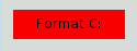
What happened is this:
We have made a request that cannot be satisfied using the native styles alone (e.g., the Windows Vista theme engine doesn’t let us specify the background color of a button).
Therefore, the button is rendered using style sheets.
We haven’t specified any values for border-width and border-style , so by default we obtain a 0-pixel wide border of style
none.Let’s improve the situation by specifying a border:
QPushButton#evilButton {
    background-color: red;
    border-style: outset;
    border-width: 2px;
    border-color: beige;
}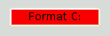
Things look already a lot better. But the button looks a bit cramped. Let’s specify some spacing between the border and the text using the padding . Additionally, we will enforce a minimum width, round the corners, and specify a larger font to make the button look nicer:
QPushButton#evilButton {
    background-color: red;
    border-style: outset;
    border-width: 2px;
    border-radius: 10px;
    border-color: beige;
    font: bold 14px;
    min-width: 10em;
    padding: 6px;
}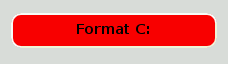
The only issue remaining is that the button doesn’t react when we press it. We can fix this by specifying a slightly different background color and use a different border style.
QPushButton#evilButton {
    background-color: red;
    border-style: outset;
    border-width: 2px;
    border-radius: 10px;
    border-color: beige;
    font: bold 14px;
    min-width: 10em;
    padding: 6px;
}
QPushButton#evilButton:pressed {
    background-color: rgb(224, 0, 0);
    border-style: inset;
}
Since red seems to be our favorite color, let’s make the text in
QLineEditred by setting the following application-wide stylesheet:QLineEdit { color: red }However, we would like to give a visual indication that a
QLineEditis read-only by making it appear gray:QLineEdit { color: red } QLineEdit[readOnly="true"] { color: gray }At some point, our design team comes with the requirement that all
QLineEdits in the registration form (with theobject nameregistrationDialog) to be brown:QLineEdit { color: red } QLineEdit[readOnly="true"] { color: gray } #registrationDialog QLineEdit { color: brown }A few UI design meetings later, we decide that all our
QDialogs should have brown coloredQLineEdits:QLineEdit { color: red } QLineEdit[readOnly="true"] { color: gray } QDialog QLineEdit { color: brown }Quiz: What happens if we have a read-only
QLineEdit在QDialog? [Hint: The 解决冲突 section above explains what happens in cases like this.]
This section provides examples to customize specific widgets using Style Sheets.
The background of any
QAbstractScrollArea(Item views,QTextEditandQTextBrowser) can be set using the background properties. For example, to set a background-image that scrolls with the scroll bar:QTextEdit, QListView { background-color: white; background-image: url(draft.png); background-attachment: scroll; }If the background-image is to be fixed with the viewport:
QTextEdit, QListView {
    background-color: white;
    background-image: url(draft.png);
    background-attachment: fixed;
}
Styling of a
QCheckBoxis almost identical to styling aQRadioButton. The main difference is that a tristateQCheckBoxhas an indeterminate state.QCheckBox { spacing: 5px; } QCheckBox::indicator { width: 13px; height: 13px; } QCheckBox::indicator:unchecked { image: url(:/images/checkbox_unchecked.png); } QCheckBox::indicator:unchecked:hover { image: url(:/images/checkbox_unchecked_hover.png); } QCheckBox::indicator:unchecked:pressed { image: url(:/images/checkbox_unchecked_pressed.png); } QCheckBox::indicator:checked { image: url(:/images/checkbox_checked.png); } QCheckBox::indicator:checked:hover { image: url(:/images/checkbox_checked_hover.png); } QCheckBox::indicator:checked:pressed { image: url(:/images/checkbox_checked_pressed.png); } QCheckBox::indicator:indeterminate:hover { image: url(:/images/checkbox_indeterminate_hover.png); } QCheckBox::indicator:indeterminate:pressed { image: url(:/images/checkbox_indeterminate_pressed.png); }
We will look at an example where the drop down button of a
QComboBoxappears “merged” with the combo box frame.QComboBox { border: 1px solid gray; border-radius: 3px; padding: 1px 18px 1px 3px; min-width: 6em; } QComboBox:editable { background: white; } QComboBox:!editable, QComboBox::drop-down:editable { background: qlineargradient(x1: 0, y1: 0, x2: 0, y2: 1, stop: 0 #E1E1E1, stop: 0.4 #DDDDDD, stop: 0.5 #D8D8D8, stop: 1.0 #D3D3D3); } /* QComboBox gets the "on" state when the popup is open */ QComboBox:!editable:on, QComboBox::drop-down:editable:on { background: qlineargradient(x1: 0, y1: 0, x2: 0, y2: 1, stop: 0 #D3D3D3, stop: 0.4 #D8D8D8, stop: 0.5 #DDDDDD, stop: 1.0 #E1E1E1); } QComboBox:on { /* shift the text when the popup opens */ padding-top: 3px; padding-left: 4px; } QComboBox::drop-down { subcontrol-origin: padding; subcontrol-position: top right; width: 15px; border-left-width: 1px; border-left-color: darkgray; border-left-style: solid; /* just a single line */ border-top-right-radius: 3px; /* same radius as the QComboBox */ border-bottom-right-radius: 3px; } QComboBox::down-arrow { image: url(/usr/share/icons/crystalsvg/16x16/actions/1downarrow.png); } QComboBox::down-arrow:on { /* shift the arrow when popup is open */ top: 1px; left: 1px; }The pop-up of the
QComboBox是QAbstractItemViewand is styled using the descendant selector:QComboBox QAbstractItemView { border: 2px solid darkgray; selection-background-color: lightgray; }
The title bar and the buttons of a
QDockWidgetcan be customized as follows:QDockWidget { border: 1px solid lightgray; titlebar-close-icon: url(close.png); titlebar-normal-icon: url(undock.png); } QDockWidget::title { text-align: left; /* align the text to the left */ background: lightgray; padding-left: 5px; } QDockWidget::close-button, QDockWidget::float-button { border: 1px solid transparent; background: darkgray; padding: 0px; } QDockWidget::close-button:hover, QDockWidget::float-button:hover { background: gray; } QDockWidget::close-button:pressed, QDockWidget::float-button:pressed { padding: 1px -1px -1px 1px; }If one desires to move the dock widget buttons to the left, the following style sheet can be used:
QDockWidget {
    border: 1px solid lightgray;
    titlebar-close-icon: url(close.png);
    titlebar-normal-icon: url(float.png);
}
QDockWidget::title {
    text-align: left;
    background: lightgray;
    padding-left: 35px;
}
QDockWidget::close-button, QDockWidget::float-button {
    background: darkgray;
    padding: 0px;
    icon-size: 14px; /* maximum icon size */
}
QDockWidget::close-button:hover, QDockWidget::float-button:hover {
    background: gray;
}
QDockWidget::close-button:pressed, QDockWidget::float-button:pressed {
    padding: 1px -1px -1px 1px;
}
QDockWidget::close-button {
    subcontrol-position: top left;
    subcontrol-origin: margin;
    position: absolute;
    top: 0px; left: 0px; bottom: 0px;
    width: 14px;
}
QDockWidget::float-button {
    subcontrol-position: top left;
    subcontrol-origin: margin;
    position: absolute;
    top: 0px; left: 16px; bottom: 0px;
    width: 14px;
}
注意
To customize the separator (resize handle) of a
QDockWidget, use QMainWindow::separator.
Let us look at an example that moves the
QGroupBox‘s title to the center.QGroupBox { background-color: qlineargradient(x1: 0, y1: 0, x2: 0, y2: 1, stop: 0 #E0E0E0, stop: 1 #FFFFFF); border: 2px solid gray; border-radius: 5px; margin-top: 1ex; /* leave space at the top for the title */ } QGroupBox::title { subcontrol-origin: margin; subcontrol-position: top center; /* position at the top center */ padding: 0 3px; background-color: qlineargradient(x1: 0, y1: 0, x2: 0, y2: 1, stop: 0 #FF0ECE, stop: 1 #FFFFFF); }For a checkable
QGroupBox, use the {#indicator-sub}{::indicator} subcontrol and style it exactly like aQCheckBox(i.e)QGroupBox::indicator { width: 13px; height: 13px; } QGroupBox::indicator:unchecked { image: url(:/images/checkbox_unchecked.png); } /* proceed with styling just like QCheckBox */
QHeaderViewis customized as follows:QHeaderView::section { background-color: qlineargradient(x1:0, y1:0, x2:0, y2:1, stop:0 #616161, stop: 0.5 #505050, stop: 0.6 #434343, stop:1 #656565); color: white; padding-left: 4px; border: 1px solid #6c6c6c; } QHeaderView::section:checked { background-color: red; } /* style the sort indicator */ QHeaderView::down-arrow { image: url(down_arrow.png); } QHeaderView::up-arrow { image: url(up_arrow.png); }
The frame of a
QLineEditis styled using the Box 模型 . To create a line edit with rounded corners, we can set:QLineEdit { border: 2px solid gray; border-radius: 10px; padding: 0 8px; background: yellow; selection-background-color: darkgray; }The password character of line edits that have
Passwordecho mode can be set using:QLineEdit[echoMode="2"] { lineedit-password-character: 9679; }The background of a read only
QLineEditcan be modified as below:QLineEdit:read-only { background: lightblue; }
The background color of alternating rows can be customized using the following style sheet:
QListView {
    alternate-background-color: yellow;
}
To provide a special background when you hover over items, we can use the ::item subcontrol. For example,
QListView {
    show-decoration-selected: 1; /* make the selection span the entire width of the view */
}
QListView::item:alternate {
    background: #EEEEEE;
}
QListView::item:selected {
    border: 1px solid #6a6ea9;
}
QListView::item:selected:!active {
    background: qlineargradient(x1: 0, y1: 0, x2: 0, y2: 1,
                                stop: 0 #ABAFE5, stop: 1 #8588B2);
}
QListView::item:selected:active {
    background: qlineargradient(x1: 0, y1: 0, x2: 0, y2: 1,
                                stop: 0 #6a6ea9, stop: 1 #888dd9);
}
QListView::item:hover {
    background: qlineargradient(x1: 0, y1: 0, x2: 0, y2: 1,
                                stop: 0 #FAFBFE, stop: 1 #DCDEF1);
}
The separator of a
QMainWindowcan be styled as follows:QMainWindow::separator { background: yellow; width: 10px; /* when vertical */ height: 10px; /* when horizontal */ } QMainWindow::separator:hover { background: red; }
QProgressBar‘s border , chunk ,和 text-align can be customized using style sheets. However, if one property or sub-control is customized, all the other properties or sub-controls must be customized as well.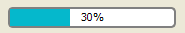
For example, we change the border to grey and the chunk to cerulean.
QProgressBar {
    border: 2px solid grey;
    border-radius: 5px;
}
QProgressBar::chunk {
    background-color: #05B8CC;
    width: 20px;
}
This leaves the text-align , which we customize by positioning the text in the center of the progress bar.
QProgressBar {
    border: 2px solid grey;
    border-radius: 5px;
    text-align: center;
}
A margin can be included to obtain more visible chunks.
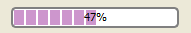
In the screenshot above, we use a margin of 0.5 pixels.
QProgressBar::chunk {
    background-color: #CD96CD;
    width: 10px;
    margin: 0.5px;
}
A
QPushButtonis styled as follows:QPushButton { border: 2px solid #8f8f91; border-radius: 6px; background-color: qlineargradient(x1: 0, y1: 0, x2: 0, y2: 1, stop: 0 #f6f7fa, stop: 1 #dadbde); min-width: 80px; } QPushButton:pressed { background-color: qlineargradient(x1: 0, y1: 0, x2: 0, y2: 1, stop: 0 #dadbde, stop: 1 #f6f7fa); } QPushButton:flat { border: none; /* no border for a flat push button */ } QPushButton:default { border-color: navy; /* make the default button prominent */ }对于
QPushButtonwith a menu, use the ::menu-indicator subcontrol.QPushButton:open { /* when the button has its menu open */ background-color: qlineargradient(x1: 0, y1: 0, x2: 0, y2: 1, stop: 0 #dadbde, stop: 1 #f6f7fa); } QPushButton::menu-indicator { image: url(menu_indicator.png); subcontrol-origin: padding; subcontrol-position: bottom right; } QPushButton::menu-indicator:pressed, QPushButton::menu-indicator:open { position: relative; top: 2px; left: 2px; /* shift the arrow by 2 px */ }Checkable
QPushButtonhave the :checked pseudo state set.
The indicator of a
QRadioButtoncan be changed using:QRadioButton::indicator { width: 13px; height: 13px; } QRadioButton::indicator::unchecked { image: url(:/images/radiobutton_unchecked.png); } QRadioButton::indicator:unchecked:hover { image: url(:/images/radiobutton_unchecked_hover.png); } QRadioButton::indicator:unchecked:pressed { image: url(:/images/radiobutton_unchecked_pressed.png); } QRadioButton::indicator::checked { image: url(:/images/radiobutton_checked.png); } QRadioButton::indicator:checked:hover { image: url(:/images/radiobutton_checked_hover.png); } QRadioButton::indicator:checked:pressed { image: url(:/images/radiobutton_checked_pressed.png); }
QScrollBarcan be styled using its subcontrols like handle , add-line , sub-line , and so on. Note that if one property or sub-control is customized, all the other properties or sub-controls must be customized as well.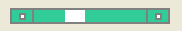
The scroll bar above has been styled in aquamarine with a solid grey border.
QScrollBar:horizontal {
    border: 2px solid grey;
    background: #32CC99;
    height: 15px;
    margin: 0px 20px 0 20px;
}
QScrollBar::handle:horizontal {
    background: white;
    min-width: 20px;
}
QScrollBar::add-line:horizontal {
    border: 2px solid grey;
    background: #32CC99;
    width: 20px;
    subcontrol-position: right;
    subcontrol-origin: margin;
}
QScrollBar::sub-line:horizontal {
    border: 2px solid grey;
    background: #32CC99;
    width: 20px;
    subcontrol-position: left;
    subcontrol-origin: margin;
}
left-arrow and right-arrow have a solid grey border with a white background. As an alternative, you could also embed the image of an arrow.
QScrollBar:left-arrow:horizontal, QScrollBar::right-arrow:horizontal {
    border: 2px solid grey;
    width: 3px;
    height: 3px;
    background: white;
}
QScrollBar::add-page:horizontal, QScrollBar::sub-page:horizontal {
    background: none;
}
If you want the scroll buttons of the scroll bar to be placed together (instead of the edges) like on macOS, you can use the following stylesheet:
QScrollBar:horizontal {
    border: 2px solid green;
    background: cyan;
    height: 15px;
    margin: 0px 40px 0 0px;
}
QScrollBar::handle:horizontal {
    background: gray;
    min-width: 20px;
}
QScrollBar::add-line:horizontal {
    background: blue;
    width: 16px;
    subcontrol-position: right;
    subcontrol-origin: margin;
    border: 2px solid black;
}
QScrollBar::sub-line:horizontal {
    background: magenta;
    width: 16px;
    subcontrol-position: top right;
    subcontrol-origin: margin;
    border: 2px solid black;
    position: absolute;
    right: 20px;
}
QScrollBar:left-arrow:horizontal, QScrollBar::right-arrow:horizontal {
    width: 3px;
    height: 3px;
    background: pink;
}
QScrollBar::add-page:horizontal, QScrollBar::sub-page:horizontal {
    background: none;
}
The scroll bar using the above stylesheet looks like this:

To customize a vertical scroll bar use a style sheet similar to the following:
QScrollBar:vertical {
    border: 2px solid grey;
    background: #32CC99;
    width: 15px;
    margin: 22px 0 22px 0;
}
QScrollBar::handle:vertical {
    background: white;
    min-height: 20px;
}
QScrollBar::add-line:vertical {
    border: 2px solid grey;
    background: #32CC99;
    height: 20px;
    subcontrol-position: bottom;
    subcontrol-origin: margin;
}
QScrollBar::sub-line:vertical {
    border: 2px solid grey;
    background: #32CC99;
    height: 20px;
    subcontrol-position: top;
    subcontrol-origin: margin;
}
QScrollBar::up-arrow:vertical, QScrollBar::down-arrow:vertical {
    border: 2px solid grey;
    width: 3px;
    height: 3px;
    background: white;
}
QScrollBar::add-page:vertical, QScrollBar::sub-page:vertical {
    background: none;
}
QSizeGripis usually styled by just setting an image.QSizeGrip { image: url(:/images/sizegrip.png); width: 16px; height: 16px; }
You can style horizontal slider as below:
QSlider::groove:horizontal {
    border: 1px solid #999999;
    height: 8px; /* the groove expands to the size of the slider by default. by giving it a height, it has a fixed size */
    background: qlineargradient(x1:0, y1:0, x2:0, y2:1, stop:0 #B1B1B1, stop:1 #c4c4c4);
    margin: 2px 0;
}
QSlider::handle:horizontal {
    background: qlineargradient(x1:0, y1:0, x2:1, y2:1, stop:0 #b4b4b4, stop:1 #8f8f8f);
    border: 1px solid #5c5c5c;
    width: 18px;
    margin: -2px 0; /* handle is placed by default on the contents rect of the groove. Expand outside the groove */
    border-radius: 3px;
}
If you want to change the color of the slider parts before and after the handle, you can use the add-page and sub-page subcontrols. For example, for a vertical slider:
QSlider::groove:vertical {
    background: red;
    position: absolute; /* absolutely position 4px from the left and right of the widget. setting margins on the widget should work too... */
    left: 4px; right: 4px;
}
QSlider::handle:vertical {
    height: 10px;
    background: green;
    margin: 0 -4px; /* expand outside the groove */
}
QSlider::add-page:vertical {
    background: white;
}
QSlider::sub-page:vertical {
    background: pink;
}
QSpinBoxcan be completely customized as below (the style sheet has commentary inline):QSpinBox { padding-right: 15px; /* make room for the arrows */ border-image: url(:/images/frame.png) 4; border-width: 3; } QSpinBox::up-button { subcontrol-origin: border; subcontrol-position: top right; /* position at the top right corner */ width: 16px; /* 16 + 2*1px border-width = 15px padding + 3px parent border */ border-image: url(:/images/spinup.png) 1; border-width: 1px; } QSpinBox::up-button:hover { border-image: url(:/images/spinup_hover.png) 1; } QSpinBox::up-button:pressed { border-image: url(:/images/spinup_pressed.png) 1; } QSpinBox::up-arrow { image: url(:/images/up_arrow.png); width: 7px; height: 7px; } QSpinBox::up-arrow:disabled, QSpinBox::up-arrow:off { /* off state when value is max */ image: url(:/images/up_arrow_disabled.png); } QSpinBox::down-button { subcontrol-origin: border; subcontrol-position: bottom right; /* position at bottom right corner */ width: 16px; border-image: url(:/images/spindown.png) 1; border-width: 1px; border-top-width: 0; } QSpinBox::down-button:hover { border-image: url(:/images/spindown_hover.png) 1; } QSpinBox::down-button:pressed { border-image: url(:/images/spindown_pressed.png) 1; } QSpinBox::down-arrow { image: url(:/images/down_arrow.png); width: 7px; height: 7px; } QSpinBox::down-arrow:disabled, QSpinBox::down-arrow:off { /* off state when value in min */ image: url(:/images/down_arrow_disabled.png); }
A
QSplitterderives from aQFrameand hence can be styled like aQFrame. The grip or the handle is customized using the ::handle subcontrol.QSplitter::handle { image: url(images/splitter.png); } QSplitter::handle:horizontal { width: 2px; } QSplitter::handle:vertical { height: 2px; } QSplitter::handle:pressed { url(images/splitter_pressed.png); }
We can provide a background for the status bar and a border for items inside the status bar as follows:
QStatusBar {
    background: brown;
}
QStatusBar::item {
    border: 1px solid red;
    border-radius: 3px;
}
Note that widgets that have been added to the
QStatusBarcan be styled using the descendant declaration (i.e)QStatusBar QLabel { border: 3px solid white; }
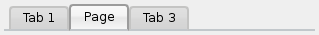
For the screenshot above, we need a stylesheet as follows:
QTabWidget::pane { /* The tab widget frame */
    border-top: 2px solid #C2C7CB;
}
QTabWidget::tab-bar {
    left: 5px; /* move to the right by 5px */
}
/* Style the tab using the tab sub-control. Note that
    it reads QTabBar _not_ QTabWidget */
QTabBar::tab {
    background: qlineargradient(x1: 0, y1: 0, x2: 0, y2: 1,
                                stop: 0 #E1E1E1, stop: 0.4 #DDDDDD,
                                stop: 0.5 #D8D8D8, stop: 1.0 #D3D3D3);
    border: 2px solid #C4C4C3;
    border-bottom-color: #C2C7CB; /* same as the pane color */
    border-top-left-radius: 4px;
    border-top-right-radius: 4px;
    min-width: 8ex;
    padding: 2px;
}
QTabBar::tab:selected, QTabBar::tab:hover {
    background: qlineargradient(x1: 0, y1: 0, x2: 0, y2: 1,
                                stop: 0 #fafafa, stop: 0.4 #f4f4f4,
                                stop: 0.5 #e7e7e7, stop: 1.0 #fafafa);
}
QTabBar::tab:selected {
    border-color: #9B9B9B;
    border-bottom-color: #C2C7CB; /* same as pane color */
}
QTabBar::tab:!selected {
    margin-top: 2px; /* make non-selected tabs look smaller */
}
Often we require the tabs to overlap to look like below:
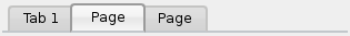
For a tab widget that looks like above, we make use of negative margins . The resulting stylesheet looks like this:
QTabWidget::pane { /* The tab widget frame */
    border-top: 2px solid #C2C7CB;
}
QTabWidget::tab-bar {
    left: 5px; /* move to the right by 5px */
}
/* Style the tab using the tab sub-control. Note that
    it reads QTabBar _not_ QTabWidget */
QTabBar::tab {
    background: qlineargradient(x1: 0, y1: 0, x2: 0, y2: 1,
                                stop: 0 #E1E1E1, stop: 0.4 #DDDDDD,
                                stop: 0.5 #D8D8D8, stop: 1.0 #D3D3D3);
    border: 2px solid #C4C4C3;
    border-bottom-color: #C2C7CB; /* same as the pane color */
    border-top-left-radius: 4px;
    border-top-right-radius: 4px;
    min-width: 8ex;
    padding: 2px;
}
QTabBar::tab:selected, QTabBar::tab:hover {
    background: qlineargradient(x1: 0, y1: 0, x2: 0, y2: 1,
                                stop: 0 #fafafa, stop: 0.4 #f4f4f4,
                                stop: 0.5 #e7e7e7, stop: 1.0 #fafafa);
}
QTabBar::tab:selected {
    border-color: #9B9B9B;
    border-bottom-color: #C2C7CB; /* same as pane color */
}
QTabBar::tab:!selected {
    margin-top: 2px; /* make non-selected tabs look smaller */
}
/* make use of negative margins for overlapping tabs */
QTabBar::tab:selected {
    /* expand/overlap to the left and right by 4px */
    margin-left: -4px;
    margin-right: -4px;
}
QTabBar::tab:first:selected {
    margin-left: 0; /* the first selected tab has nothing to overlap with on the left */
}
QTabBar::tab:last:selected {
    margin-right: 0; /* the last selected tab has nothing to overlap with on the right */
}
QTabBar::tab:only-one {
    margin: 0; /* if there is only one tab, we don't want overlapping margins */
}
To move the tab bar to the center (as below), we require the following stylesheet:
 QTabWidget::pane { /* The tab widget frame */ border-top: 2px solid #C2C7CB; position: absolute; top: -0.5em; } QTabWidget::tab-bar { alignment: center; } /* Style the tab using the tab sub-control. Note that it reads QTabBar _not_ QTabWidget */ QTabBar::tab { background: qlineargradient(x1: 0, y1: 0, x2: 0, y2: 1, stop: 0 #E1E1E1, stop: 0.4 #DDDDDD, stop: 0.5 #D8D8D8, stop: 1.0 #D3D3D3); border: 2px solid #C4C4C3; border-bottom-color: #C2C7CB; /* same as the pane color */ border-top-left-radius: 4px; border-top-right-radius: 4px; min-width: 8ex; padding: 2px; } QTabBar::tab:selected, QTabBar::tab:hover { background: qlineargradient(x1: 0, y1: 0, x2: 0, y2: 1, stop: 0 #fafafa, stop: 0.4 #f4f4f4, stop: 0.5 #e7e7e7, stop: 1.0 #fafafa); } QTabBar::tab:selected { border-color: #9B9B9B; border-bottom-color: #C2C7CB; /* same as pane color */ }
The tear indicator and the scroll buttons can be further customized as follows:
QTabBar::tear {
    image: url(tear_indicator.png);
}
QTabBar::scroller { /* the width of the scroll buttons */
    width: 20px;
}
QTabBar QToolButton { /* the scroll buttons are tool buttons */
    border-image: url(scrollbutton.png) 2;
    border-width: 2px;
}
QTabBar QToolButton::right-arrow { /* the arrow mark in the tool buttons */
    image: url(rightarrow.png);
}
QTabBar QToolButton::left-arrow {
    image: url(leftarrow.png);
}
Since Qt 4.6 the close button can be customized as follow:
QTabBar::close-button {
    image: url(close.png)
    subcontrol-position: left;
}
QTabBar::close-button:hover {
    image: url(close-hover.png)
}
Suppose we’d like our selected item in
QTableViewto have bubblegum pink fade to white as its background.
This is possible with the selection-background-color property and the syntax required is:
QTableView {
    selection-background-color: qlineargradient(x1: 0, y1: 0, x2: 0.5, y2: 0.5,
                                stop: 0 #FF92BB, stop: 1 white);
}
The corner widget can be customized using the following style sheet
QTableView QTableCornerButton::section {
    background: red;
    border: 2px outset red;
}
QTableView‘s checkbox indicator can also be customized. In the following snippet the indicatorbackground-colorin unchecked state is customized:QTableView::indicator:unchecked { background-color: #d7d6d5 }
The background and the handle of a
QToolBaris customized as below:QToolBar { background: red; spacing: 3px; /* spacing between items in the tool bar */ } QToolBar::handle { image: url(handle.png); }
The tabs of the
QToolBoxare customized using the ‘tab’ subcontrol.QToolBox::tab { background: qlineargradient(x1: 0, y1: 0, x2: 0, y2: 1, stop: 0 #E1E1E1, stop: 0.4 #DDDDDD, stop: 0.5 #D8D8D8, stop: 1.0 #D3D3D3); border-radius: 5px; color: darkgray; } QToolBox::tab:selected { /* italicize selected tabs */ font: italic; color: white; }
There are three types of QToolButtons.
QToolButtonhas no menu. In this case, theQToolButtonis styled exactly likeQPushButton。见 定制 QPushButton 范例。
QToolButtonhas a menu and has thepopupMode设为DelayedPopuporInstantPopup. In this case, theQToolButtonis styled exactly like aQPushButtonwith a menu. See 定制 QPushButton for an example of the usage of the menu-indicator pseudo state.
QToolButtonhas itspopupMode设为MenuButtonPopup. In this case, we style it as follows:QToolButton { /* all types of tool button */ border: 2px solid #8f8f91; border-radius: 6px; background-color: qlineargradient(x1: 0, y1: 0, x2: 0, y2: 1, stop: 0 #f6f7fa, stop: 1 #dadbde); } QToolButton[popupMode="1"] { /* only for MenuButtonPopup */ padding-right: 20px; /* make way for the popup button */ } QToolButton:pressed { background-color: qlineargradient(x1: 0, y1: 0, x2: 0, y2: 1, stop: 0 #dadbde, stop: 1 #f6f7fa); } /* the subcontrols below are used only in the MenuButtonPopup mode */ QToolButton::menu-button { border: 2px solid gray; border-top-right-radius: 6px; border-bottom-right-radius: 6px; /* 16px width + 4px for border = 20px allocated above */ width: 16px; } QToolButton::menu-arrow { image: url(downarrow.png); } QToolButton::menu-arrow:open { top: 1px; left: 1px; /* shift it a bit */ }
QToolTipis customized exactly like aQLabel. In addition, for platforms that support it, the opacity property may be set to adjust the opacity.例如,
QToolTip {
    border: 2px solid darkkhaki;
    padding: 5px;
    border-radius: 3px;
    opacity: 200;
}
The background color of alternating rows can be customized using the following style sheet:
QTreeView {
    alternate-background-color: yellow;
}
To provide a special background when you hover over items, we can use the ::item subcontrol. For example,
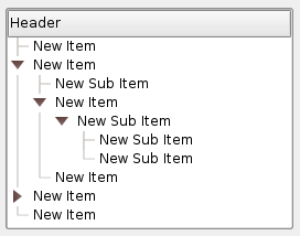
QTreeView {
    show-decoration-selected: 1;
}
QTreeView::item {
     border: 1px solid #d9d9d9;
    border-top-color: transparent;
    border-bottom-color: transparent;
}
QTreeView::item:hover {
    background: qlineargradient(x1: 0, y1: 0, x2: 0, y2: 1, stop: 0 #e7effd, stop: 1 #cbdaf1);
    border: 1px solid #bfcde4;
}
QTreeView::item:selected {
    border: 1px solid #567dbc;
}
QTreeView::item:selected:active{
    background: qlineargradient(x1: 0, y1: 0, x2: 0, y2: 1, stop: 0 #6ea1f1, stop: 1 #567dbc);
}
QTreeView::item:selected:!active {
    background: qlineargradient(x1: 0, y1: 0, x2: 0, y2: 1, stop: 0 #6b9be8, stop: 1 #577fbf);
}
The branches of a
QTreeVieware styled using the ::branch subcontrol. The following stylesheet color codes the various states when drawing a branch.QTreeView::branch { background: palette(base); } QTreeView::branch:has-siblings:!adjoins-item { background: cyan; } QTreeView::branch:has-siblings:adjoins-item { background: red; } QTreeView::branch:!has-children:!has-siblings:adjoins-item { background: blue; } QTreeView::branch:closed:has-children:has-siblings { background: pink; } QTreeView::branch:has-children:!has-siblings:closed { background: gray; } QTreeView::branch:open:has-children:has-siblings { background: magenta; } QTreeView::branch:open:has-children:!has-siblings { background: green; }Colorful, though it is, a more useful example can be made using the following images:


vline.png
branch-more.png
branch-end.png
branch-closed.png
branch-open.png
QTreeView::branch:has-siblings:!adjoins-item {
    border-image: url(vline.png) 0;
}
QTreeView::branch:has-siblings:adjoins-item {
    border-image: url(branch-more.png) 0;
}
QTreeView::branch:!has-children:!has-siblings:adjoins-item {
    border-image: url(branch-end.png) 0;
}
QTreeView::branch:has-children:!has-siblings:closed,
QTreeView::branch:closed:has-children:has-siblings {
        border-image: none;
        image: url(branch-closed.png);
}
QTreeView::branch:open:has-children:!has-siblings,
QTreeView::branch:open:has-children:has-siblings  {
        border-image: none;
        image: url(branch-open.png);
}
The resulting tree view looks like this:
This section lists some common mistakes when using stylesheets.
When styling a
QPushButton, it is often desirable to use an image as the button graphic. It is common to try the background-image property, but this has a number of drawbacks: For instance, the background will often appear hidden behind the button decoration, because it is not considered a background. In addition, if the button is resized, the entire background will be stretched or tiled, which does not always look good.It is better to use the border-image property, as it will always display the image, regardless of the background (you can combine it with a background if it has alpha values in it), and it has special settings to deal with button resizing.
Consider the following snippet:
QPushButton {
    color: grey;
    border-image: url(/home/kamlie/code/button.png) 3 10 3 10;
    border-top: 3px transparent;
    border-bottom: 3px transparent;
    border-right: 10px transparent;
    border-left: 10px transparent;
}
This will produce a button looking like this:
The numbers after the url gives the top, right, bottom and left number of pixels, respectively. These numbers correspond to the border and should not stretch when the size changes. Whenever you resize the button, the middle part of the image will stretch in both directions, while the pixels specified in the stylesheet will not. This makes the borders of the button look more natural, like this:

With borders

Without borders
另请参阅