继承者: QCommandLinkButton
PySide.QtGui.QPushButton widget provides a command button.
按钮或命令按钮或许是任何图形用户界面中最常用的 Widget。按下 (点击) 按钮以命令计算机履行某些动作或回答问题。典型按钮有 OK、Apply、Cancel、Close、Yes、No 及 Help。
命令按钮为矩形且通常显示描述其动作的文本标签。可以通过在文本首选字符前面加上 & 和号来指定快捷键。例如:
button = QPushButton("&Download", self)
在此范例中快捷方式是 Alt+D 。见 QShortcut documentation for details (to display an actual ampersand, use ‘&&').
按钮显示正文标签和可选小图标。这些可以使用构造函数设置和以后更改使用 PySide.QtGui.QAbstractButton.setText() and PySide.QtGui.QAbstractButton.setIcon() . If the button is disabled the appearance of the text and icon will be manipulated with respect to the GUI style to make the button look “disabled”.
按钮发射信号 PySide.QtGui.QAbstractButton.clicked() when it is activated by the mouse, the Spacebar or by a keyboard shortcut. Connect to this signal to perform the button's action. Push buttons also provide less commonly used signals, for example, PySide.QtGui.QAbstractButton.pressed() and PySide.QtGui.QAbstractButton.released() .
Command buttons in dialogs are by default auto-default buttons, i.e. they become the default push button automatically when they receive the keyboard input focus. A default button is a push button that is activated when the user presses the Enter or Return key in a dialog. You can change this with PySide.QtGui.QPushButton.setAutoDefault() . Note that auto-default buttons reserve a little extra space which is necessary to draw a default-button indicator. If you do not want this space around your buttons, call setAutoDefault(false).
由于如此重要,过去十年间按钮 Widget 已发展适应许多变化。微软风格指南现在展示约 10 种不同 Windows 按钮状态,文本还隐含一打以上状态当考虑所有特征组合时。
最重要的模式 (或状态):
作为一般规则,使用按钮当用户点击应用程序 (或对话框窗口) 履行动作时 (如:应用、取消、关闭和帮助) and 当 Widget 被假定拥有带文本标签的宽矩形形状时。通常,更改窗口状态而不是履行动作的较小方形按钮 (如:右上角按钮在 PySide.QtGui.QFileDialog ) 不是命令按钮,而是工具按钮。Qt 提供特殊类 ( PySide.QtGui.QToolButton ) 为这些按钮。
若需要触发行为 (见 PySide.QtGui.QAbstractButton.setCheckable() ) or a button that auto-repeats the activation signal when being pushed down like the arrows in a scroll bar (see PySide.QtGui.QAbstractButton.setAutoRepeat() ), a command button is probably not what you want. When in doubt, use a tool button.
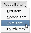
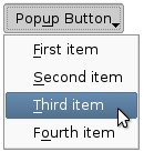
命令按钮的变体是菜单按钮。它们仅仅提供一个命令而是多个命令,由于点击它们时会弹出选项菜单。使用方法 PySide.QtGui.QPushButton.setMenu() to associate a popup menu with a push button.
其它种类的按钮:选项按钮 (见 PySide.QtGui.QRadioButton ) 和复选框 (见 PySide.QtGui.QCheckBox ).

|
A push button shown in the Macintosh widget style .
Note that when a button's width becomes smaller than 50 or its height becomes smaller than 30, the button's corners are changed from round to square. Use the
PySide.QtGui.QWidget.setMinimumSize()
function to prevent this behavior.
|

|
A push button shown in the Windows XP widget style . |

|
A push button shown in the Plastique widget style . |
在 Qt 中, PySide.QtGui.QAbstractButton base class provides most of the modes and other API, and PySide.QtGui.QPushButton provides GUI logic. See PySide.QtGui.QAbstractButton 了解有关 API 的更多信息。
另请参阅
PySide.QtGui.QToolButton PySide.QtGui.QRadioButton PySide.QtGui.QCheckBox GUI 设计手册:按钮
| 参数: |
|
|---|
构造按钮没有文本和 parent .
构造按钮采用 icon 和 text ,和 parent .
注意:也可以传递 PySide.QtGui.QPixmap 对象作为图标 (感谢由 C++ 提供的隐式类型转换)。
构造按钮采用父级 parent 和文本 text .
| 返回类型: | PySide.QtCore.bool |
|---|
This property holds whether the push button is an auto default button.
若此特性被设为 true,则按钮是自动默认按钮。
In some GUI styles a default button is drawn with an extra frame around it, up to 3 pixels or more. Qt automatically keeps this space free around auto-default buttons, i.e. auto-default buttons may have a slightly larger size hint.
This property's default is true for buttons that have a PySide.QtGui.QDialog parent; otherwise it defaults to false.
见 default() property for details of how default() and auto-default interact.
| 参数: | option – PySide.QtGui.QStyleOptionButton |
|---|
初始化 option 采用值来自此 PySide.QtGui.QPushButton 。此方法对子类是有用的,当需要 PySide.QtGui.QStyleOptionButton ,但不希望自己填充所有信息。
| 返回类型: | PySide.QtCore.bool |
|---|
This property holds whether the push button is the default button.
Default and autodefault buttons decide what happens when the user presses enter in a dialog.
A button with this property set to true (i.e., the dialog's default button,) will automatically be pressed when the user presses enter, with one exception: if an autoDefault button currently has focus, the PySide.QtGui.QPushButton.autoDefault() button is pressed. When the dialog has PySide.QtGui.QPushButton.autoDefault() buttons but no default button, pressing enter will press either the PySide.QtGui.QPushButton.autoDefault() button that currently has focus, or if no button has focus, the next PySide.QtGui.QPushButton.autoDefault() button in the focus chain.
In a dialog, only one push button at a time can be the default button. This button is then displayed with an additional frame (depending on the GUI style).
The default button behavior is provided only in dialogs. Buttons can always be clicked from the keyboard by pressing Spacebar when the button has focus.
If the default property is set to false on the current default button while the dialog is visible, a new default will automatically be assigned the next time a pushbutton in the dialog receives focus.
此特性默认为 false。
| 返回类型: | PySide.QtCore.bool |
|---|
This property holds whether the button border is raised.
This property's default is false. If this property is set, most styles will not paint the button background unless the button is being pressed. PySide.QtGui.QWidget.setAutoFillBackground() can be used to ensure that the background is filled using the QPalette.Button brush.
| 返回类型: | PySide.QtGui.QMenu |
|---|
Returns the button's associated popup menu or 0 if no popup menu has been set.
| 参数: | arg__1 – PySide.QtCore.bool |
|---|
This property holds whether the push button is an auto default button.
若此特性被设为 true,则按钮是自动默认按钮。
In some GUI styles a default button is drawn with an extra frame around it, up to 3 pixels or more. Qt automatically keeps this space free around auto-default buttons, i.e. auto-default buttons may have a slightly larger size hint.
This property's default is true for buttons that have a PySide.QtGui.QDialog parent; otherwise it defaults to false.
见 default() property for details of how default() and auto-default interact.
| 参数: | arg__1 – PySide.QtCore.bool |
|---|
This property holds whether the push button is the default button.
Default and autodefault buttons decide what happens when the user presses enter in a dialog.
A button with this property set to true (i.e., the dialog's default button,) will automatically be pressed when the user presses enter, with one exception: if an autoDefault button currently has focus, the PySide.QtGui.QPushButton.autoDefault() button is pressed. When the dialog has PySide.QtGui.QPushButton.autoDefault() buttons but no default button, pressing enter will press either the PySide.QtGui.QPushButton.autoDefault() button that currently has focus, or if no button has focus, the next PySide.QtGui.QPushButton.autoDefault() button in the focus chain.
In a dialog, only one push button at a time can be the default button. This button is then displayed with an additional frame (depending on the GUI style).
The default button behavior is provided only in dialogs. Buttons can always be clicked from the keyboard by pressing Spacebar when the button has focus.
If the default property is set to false on the current default button while the dialog is visible, a new default will automatically be assigned the next time a pushbutton in the dialog receives focus.
此特性默认为 false。
| 参数: | arg__1 – PySide.QtCore.bool |
|---|
This property holds whether the button border is raised.
This property's default is false. If this property is set, most styles will not paint the button background unless the button is being pressed. PySide.QtGui.QWidget.setAutoFillBackground() can be used to ensure that the background is filled using the QPalette.Button brush.
| 参数: | menu – PySide.QtGui.QMenu |
|---|
关联弹出菜单 menu 与此按钮。这把按钮变成菜单按钮,在某些风格中按钮文本右侧会产生小三角形。
菜单的所有权 not 被转移给按钮。
|
|
Push buttons with popup menus shown in the Plastique widget style (left) and Cleanlooks widget style (right). |
展示 (弹出) 关联的弹出菜单。若没有这样的菜单,此函数什么都不做。此函数直到用户关闭弹出菜单后才返回。
